Crafting how yours looks, sounds and lands.
You know what you're building.
The people you need to reach might not.
Not yet.
I help close that gap. The language, the branding, the imagery, the website, the deck.
The things that make it land.
The Perspective Shift
The people you need to reach only see what you put in front of them. The first impression. Get that right and the vision travels.
Where I work – The Creation Moment
Every one of these is a creation moment. I work alongside people at that point, bringing design, creative direction and strategic thinking to help the vision take shape.

The Standard
Partner Testimonial
Tom Hares, Founder and CEO, Buzzbike
Who I work with

That gap shows up in different ways. The work starts wherever the need is sharpest.
Start Here
A focused creative sprint to explore what the brand could become before committing to a full project. You leave with clarity on the direction and the creative confidence to move forward.
Duration
2–3 weeks
Branding Project
Everything the brand needs to come to life.
A complete brand foundation. Visual identity, brand system, positioning and messaging. For new ventures starting from a blank page or established businesses whose brand no longer fits.
Duration
4–6 weeks
Duration
90 minutes + follow-up presentation
Deliverable
Brand Vision document
Investment
£1,500 +VAT, credited toward any project
Website Project
Creative direction and design, from strategy and wireframing through to the finished page. Whether it's a focused landing page or a full multi-page site. A clear online presence that earns trust before you say a word.
Duration
6–8 weeks
Duration
90 minutes + follow-up presentation
Deliverable
Brand Vision document
Investment
£1,500 +VAT, credited toward any project
Reports
Making what you've achieved impossible to ignore.
Impact report design and creative direction. The report, plus launch assets, a web hub and content to keep the work visible beyond launch.
Duration
6–8 weeks
Duration
90 minutes + follow-up presentation
Deliverable
Brand Vision document
Investment
£1,500 +VAT, credited toward any project
Decks
The clearest version of the case you need to make.
Narrative, structure, design and storytelling for fundraising, sales, partnerships or board presentations. The thinking and the design happen together, so the deck argues well, not just looks good.
Duration
4 weeks
Duration
90 minutes + follow-up presentation
Deliverable
Brand Vision document
Investment
£1,500 +VAT, credited toward any project
For founders and teams who need ongoing creative direction beyond a single project, I also work as a long-term creative partner.
Selected Work



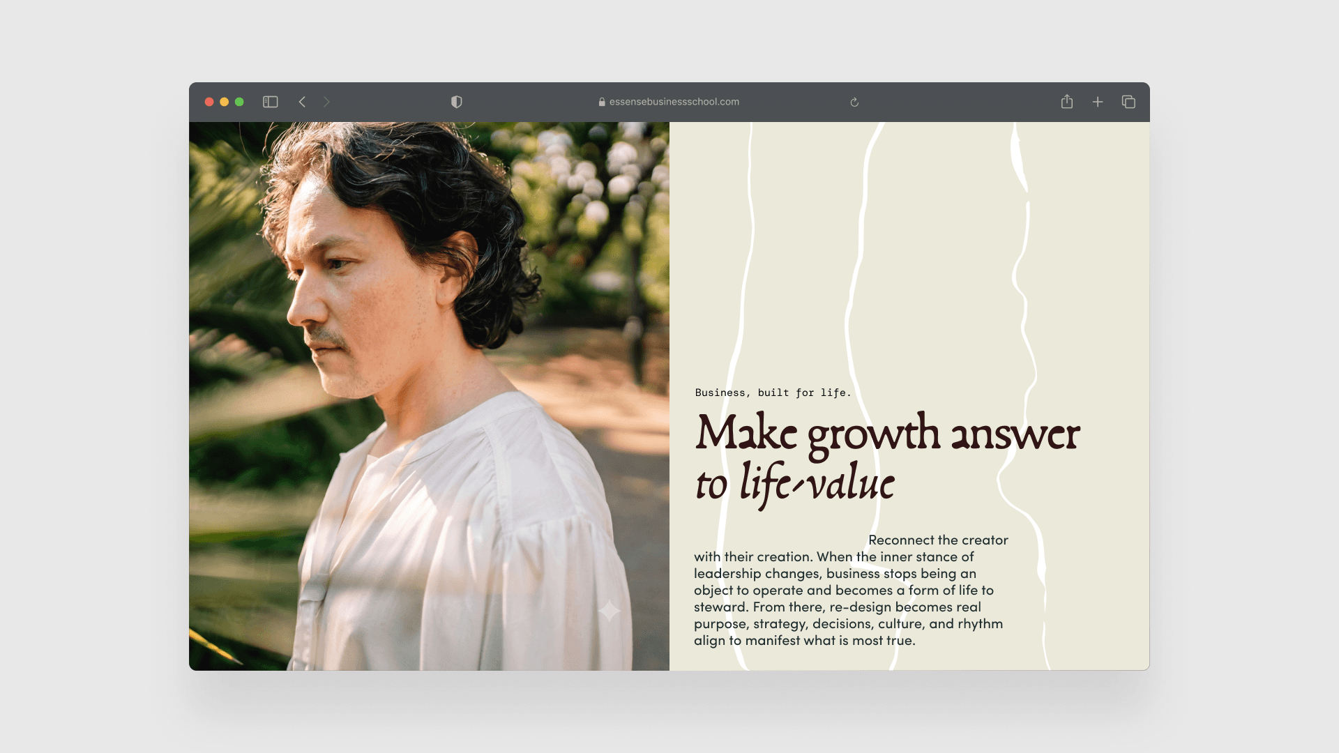
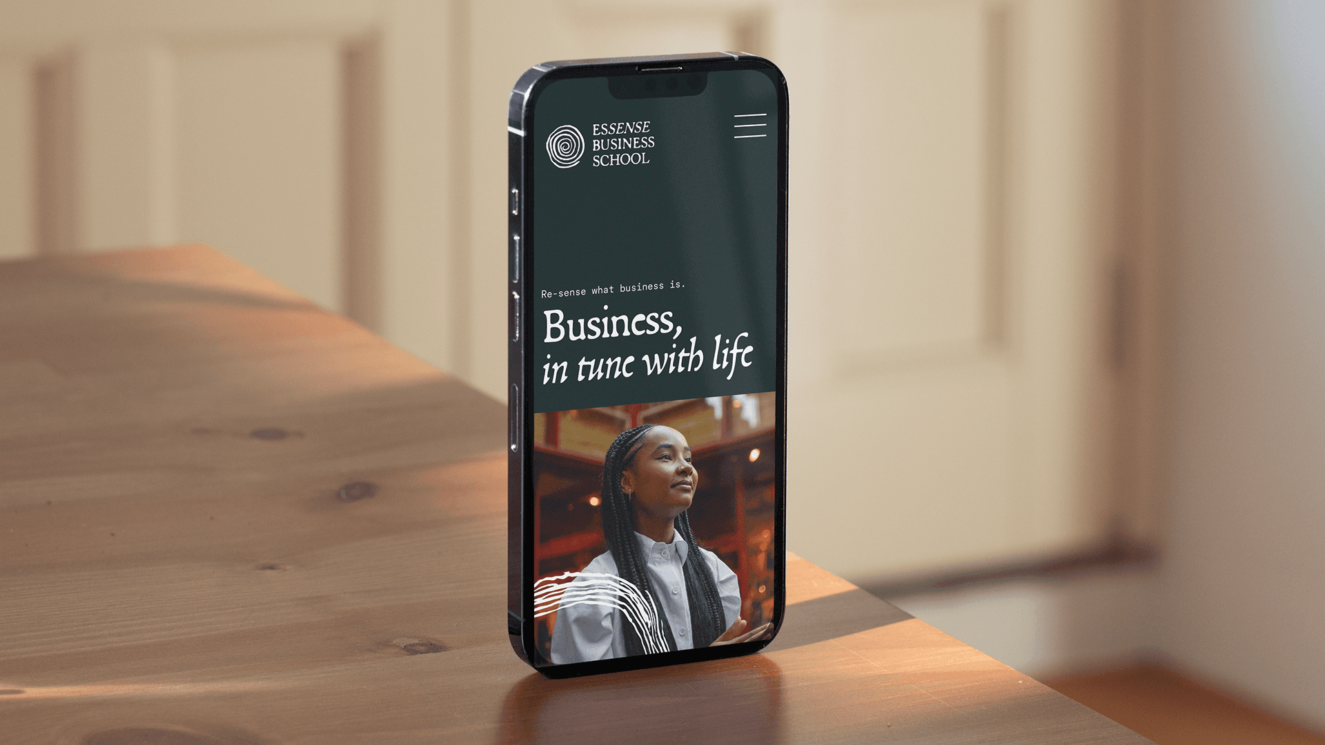
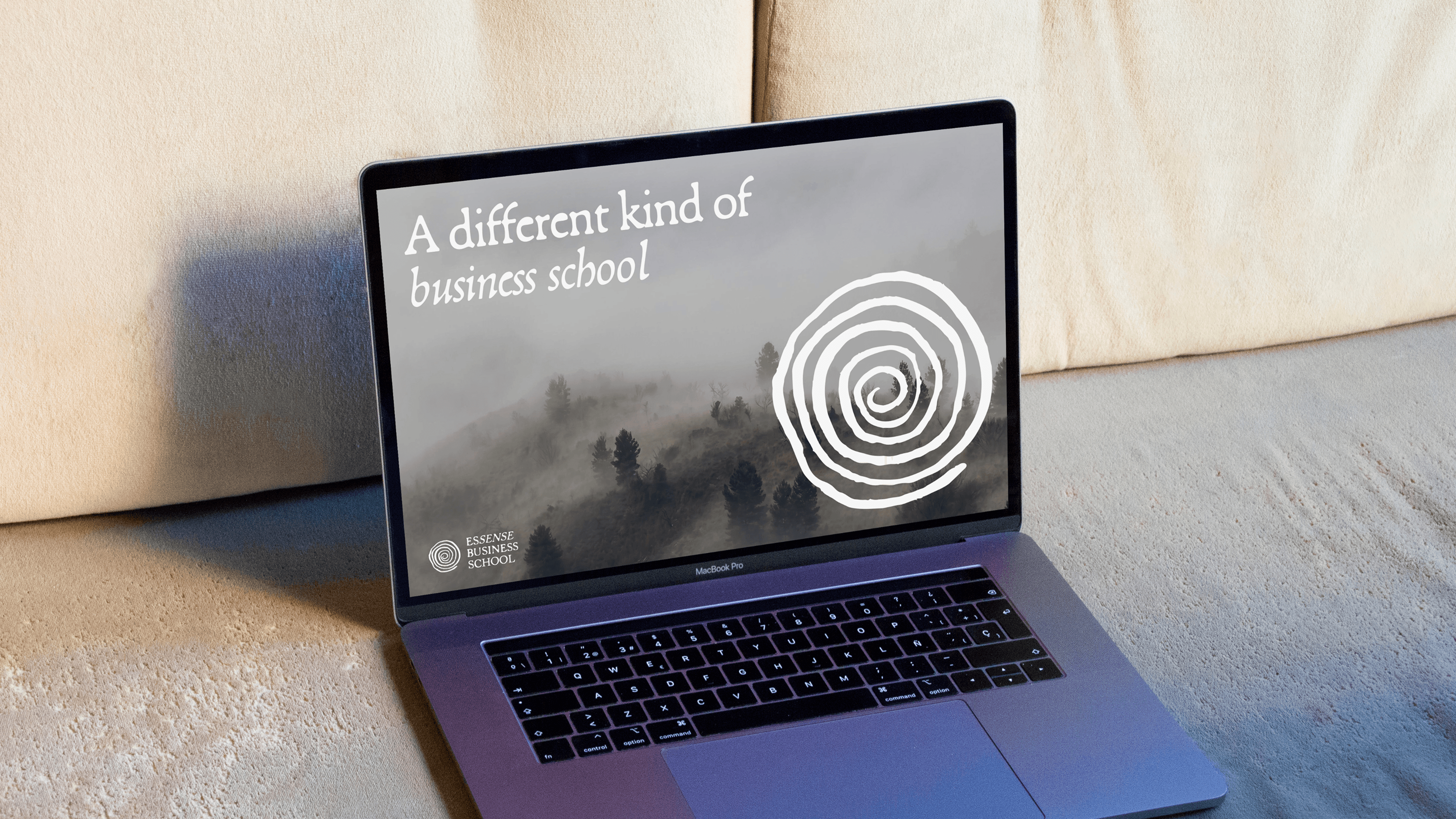
From a big idea to a defined brand. Essense Business School, nurturing a different way of doing business.
Essense · Business School
Brand Story | Visual Identity | Brand System
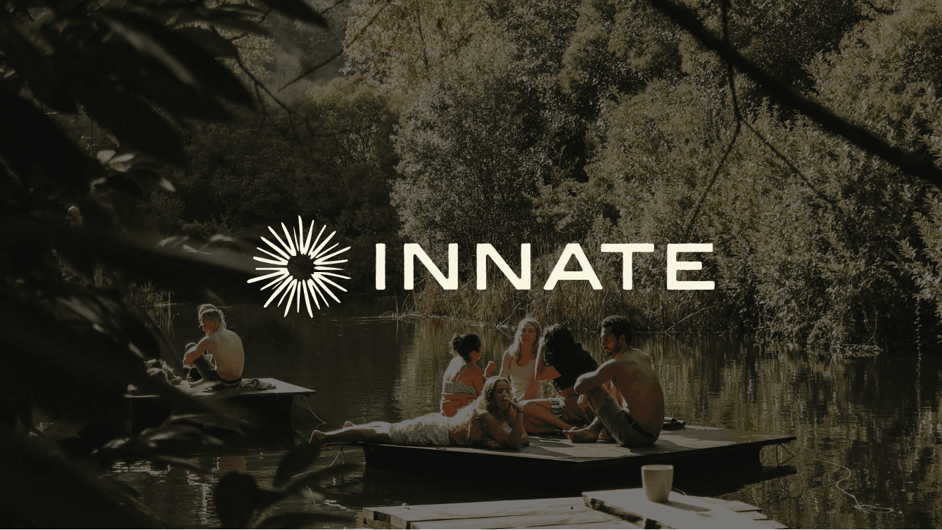
Elevating the Innate brand to attract investors. Premium enough to win the room, grounded enough for the people who will live there.
Innate · Coliving
Visual Identity


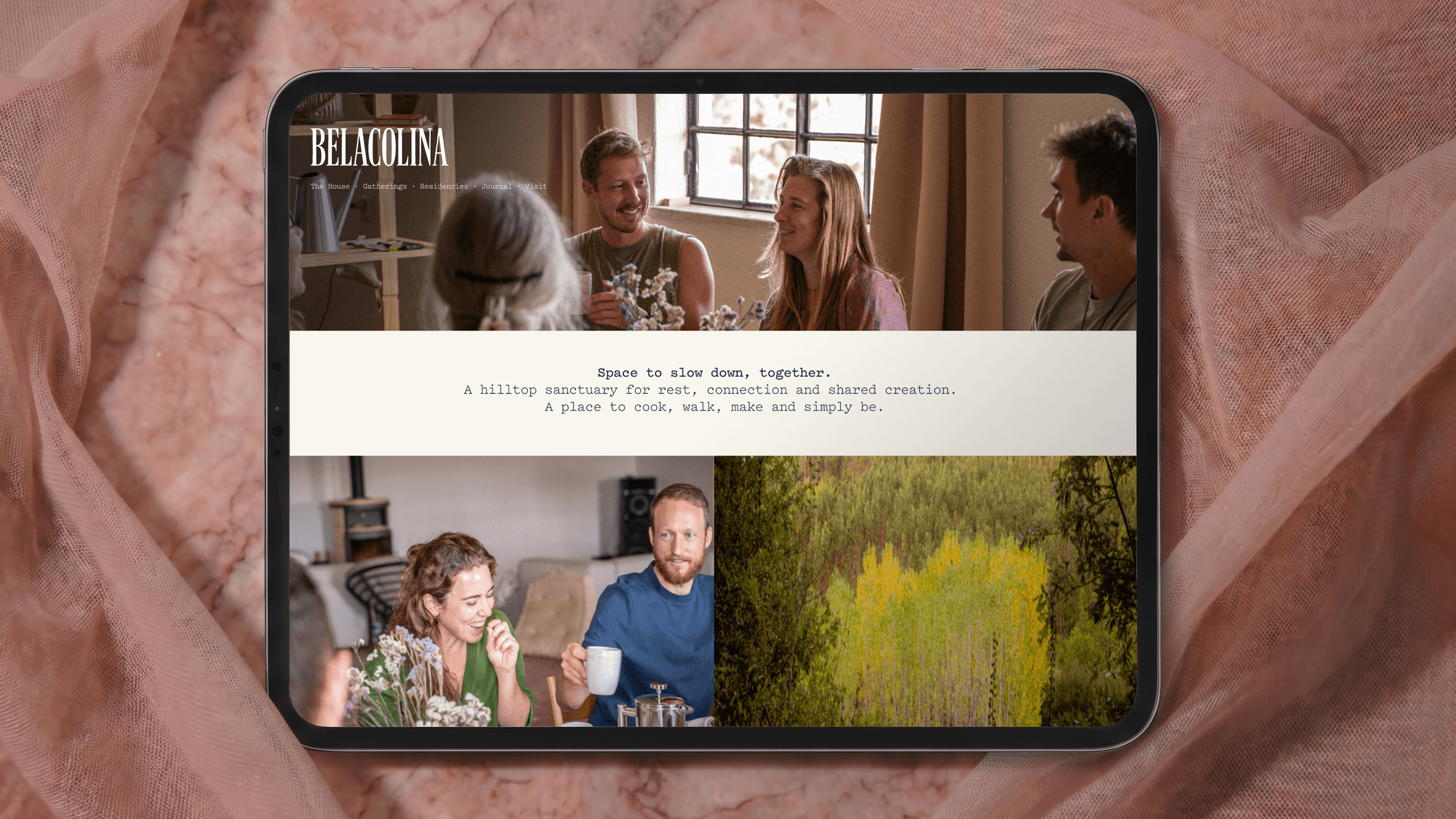


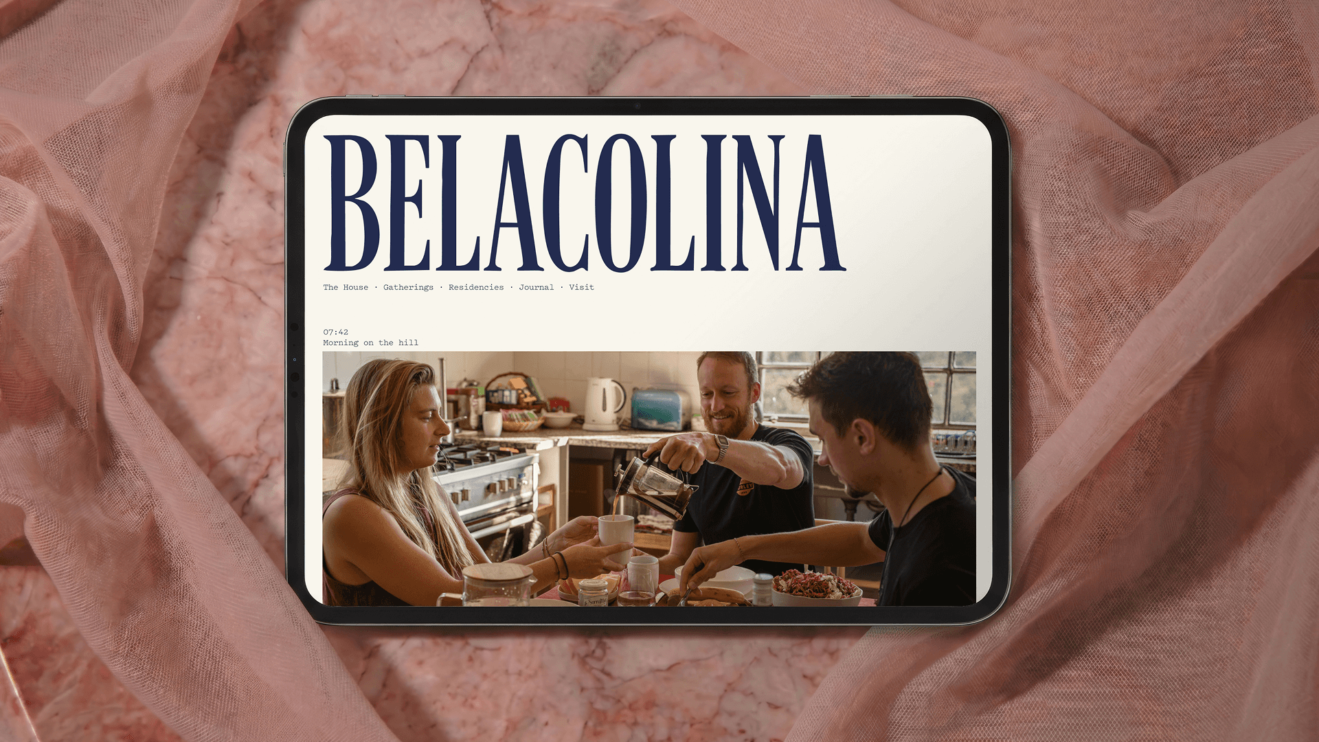
A hilltop sanctuary for rest, connection and shared creation.
Belacolina · Retreat Centre
Visual Identity | Website | Photography
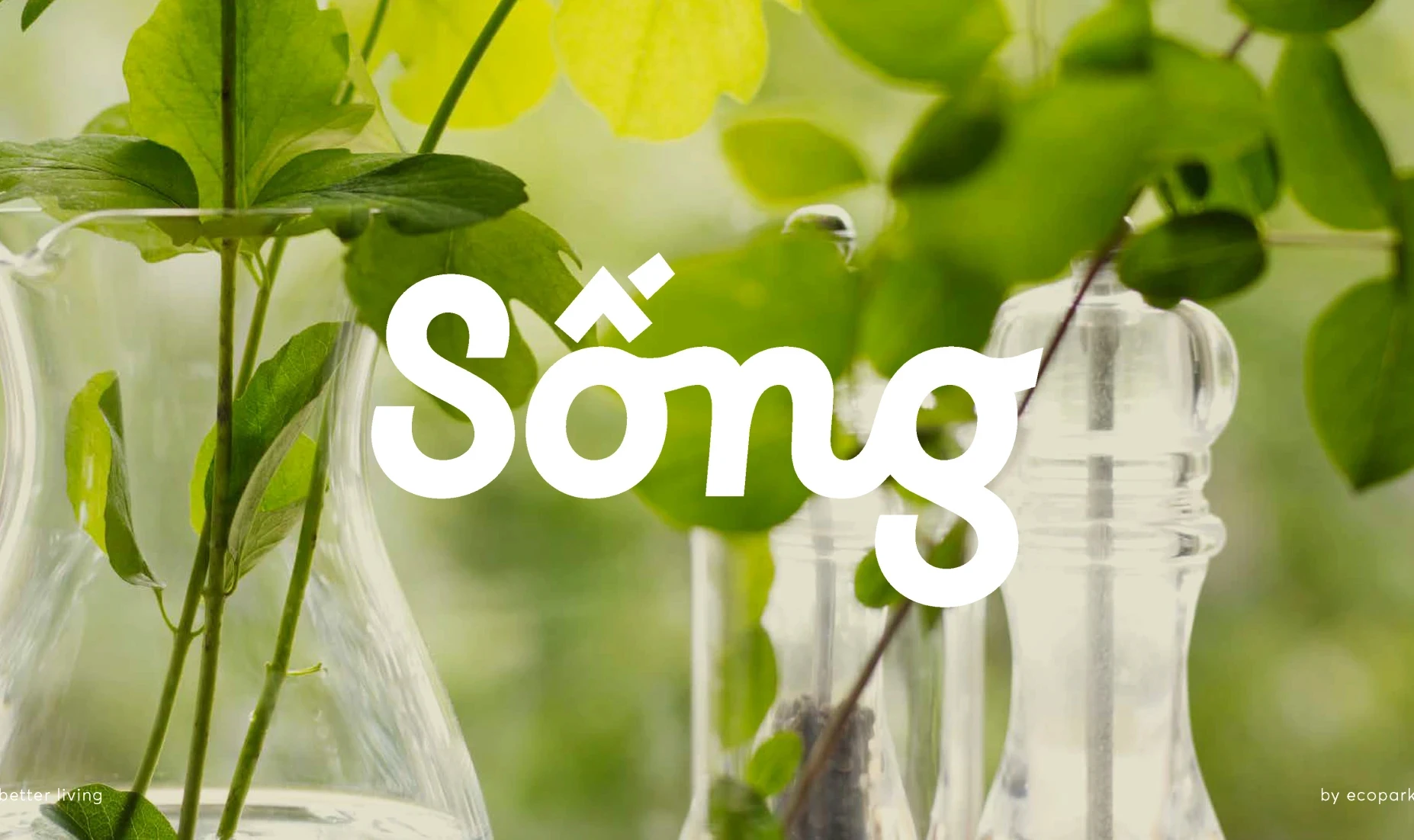
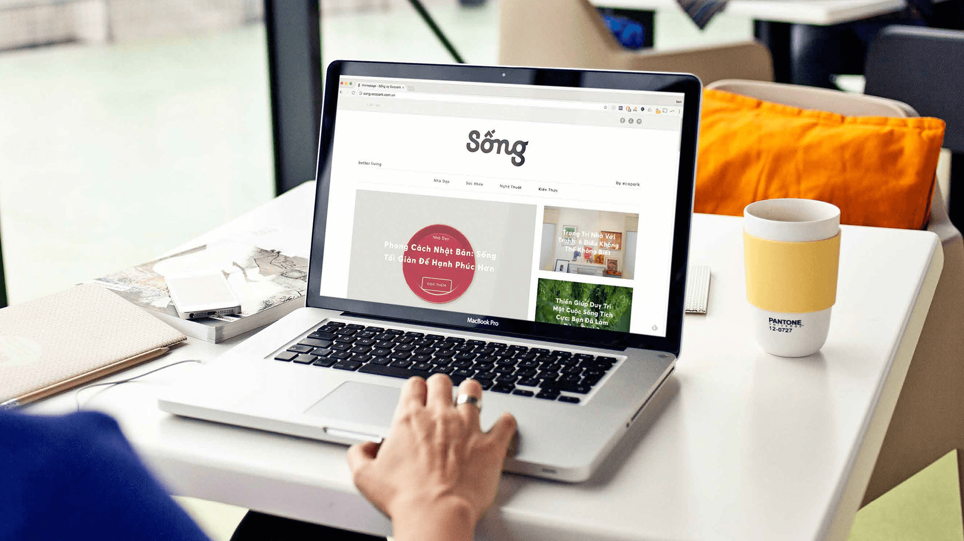
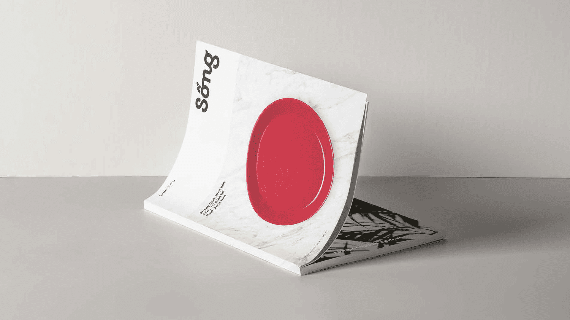
Sống means "to live." The content brand that made Ecopark's 300,000 residents care, then share. 7,191% more social engagement.
Ecopark Hanoi · Real Estate
Visual Identity | Brand System | Social Content
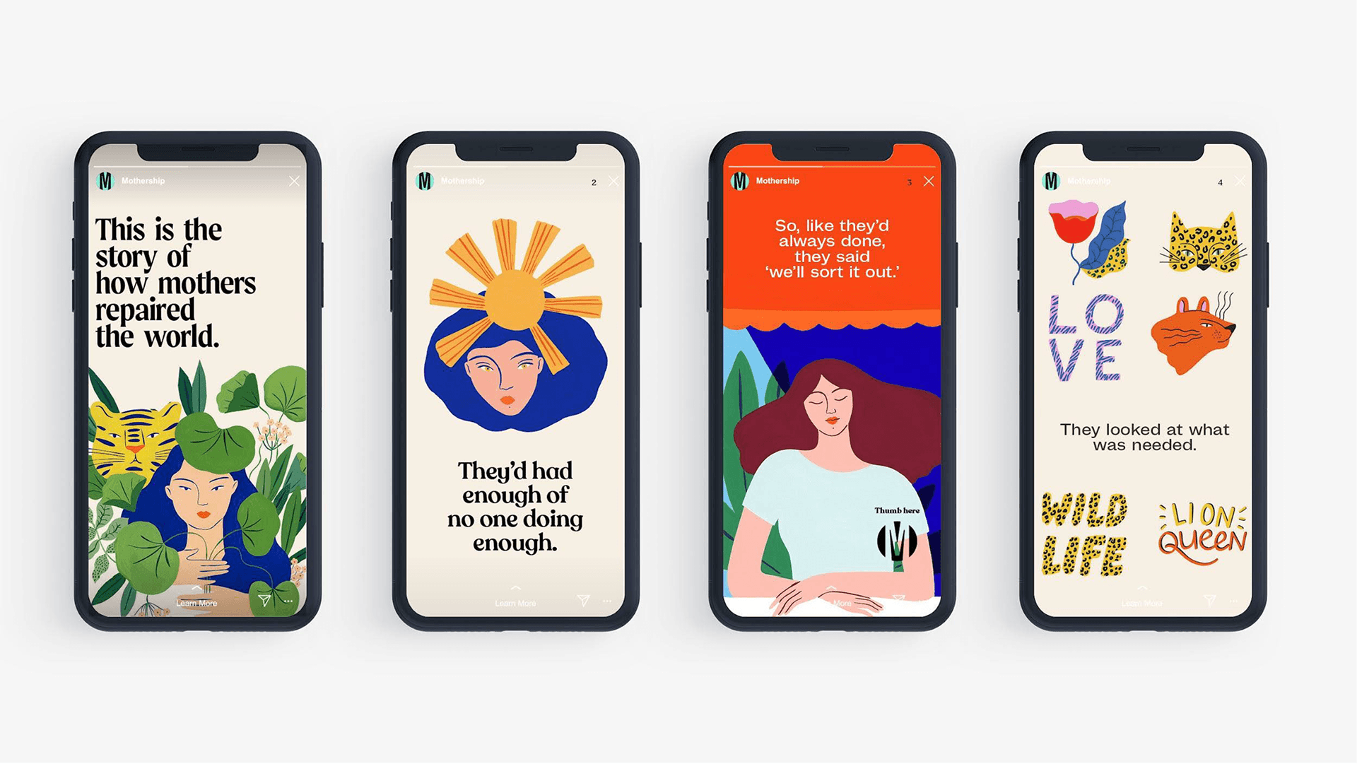
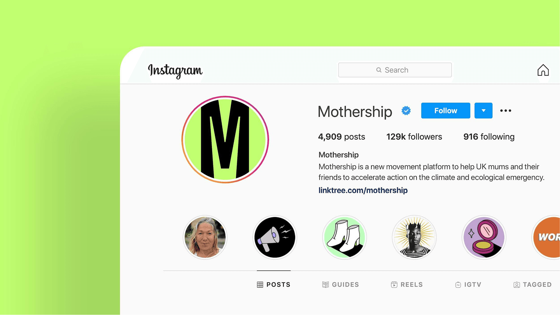
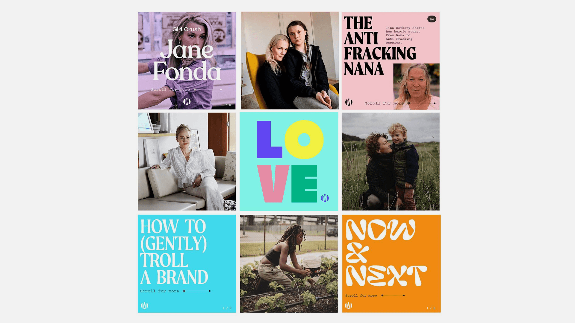
Brand identity for the movement turning mum energy into climate action.
Mothership · Sustainability Movement
Visual Identity | Social Media Design System

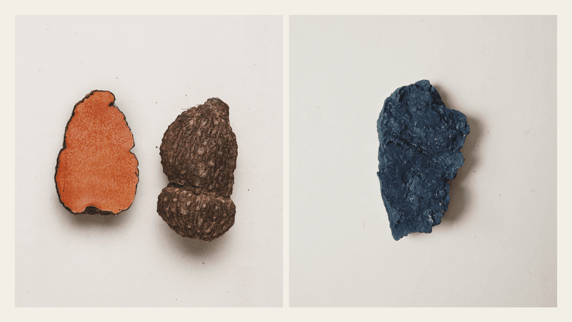

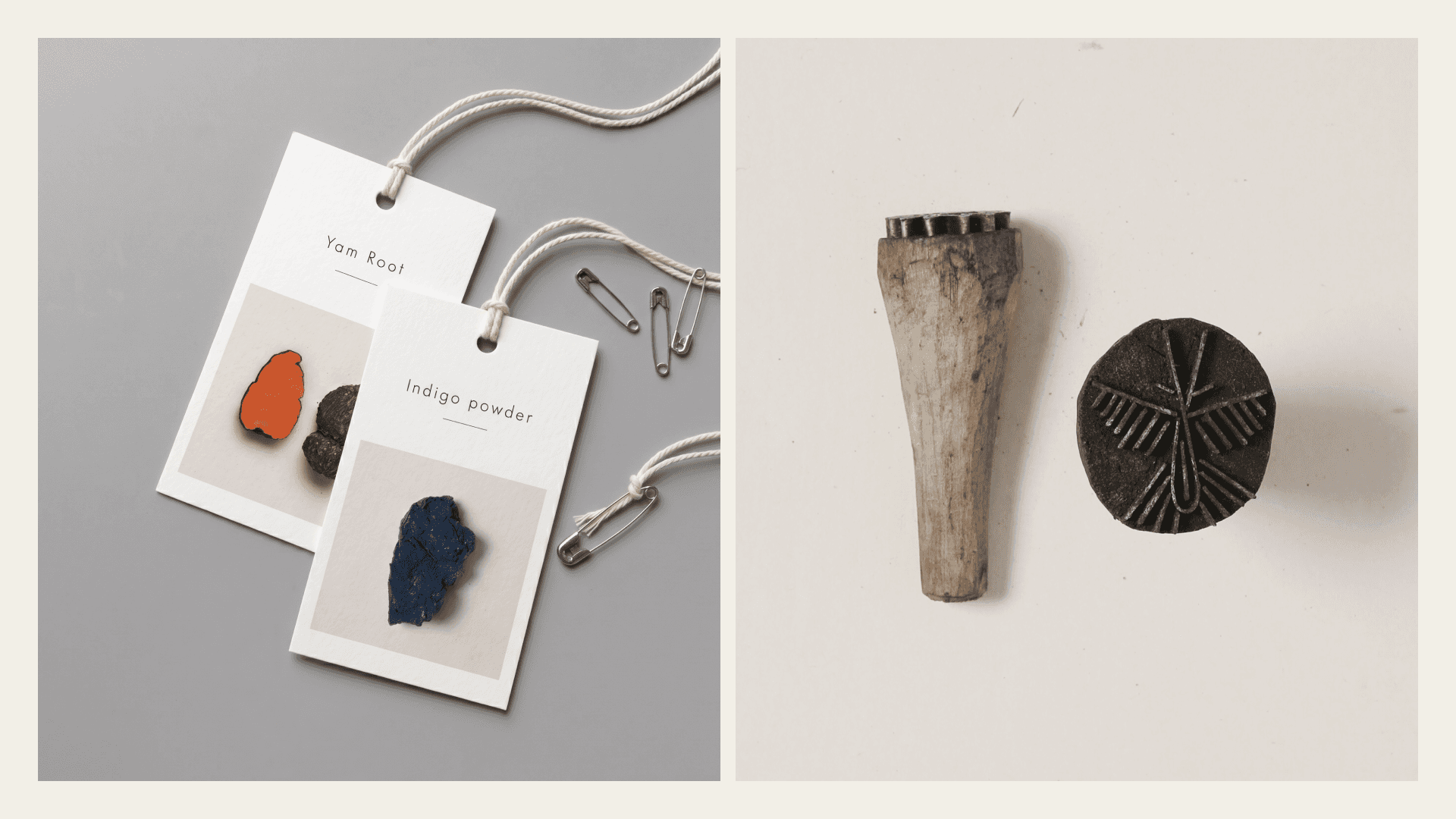

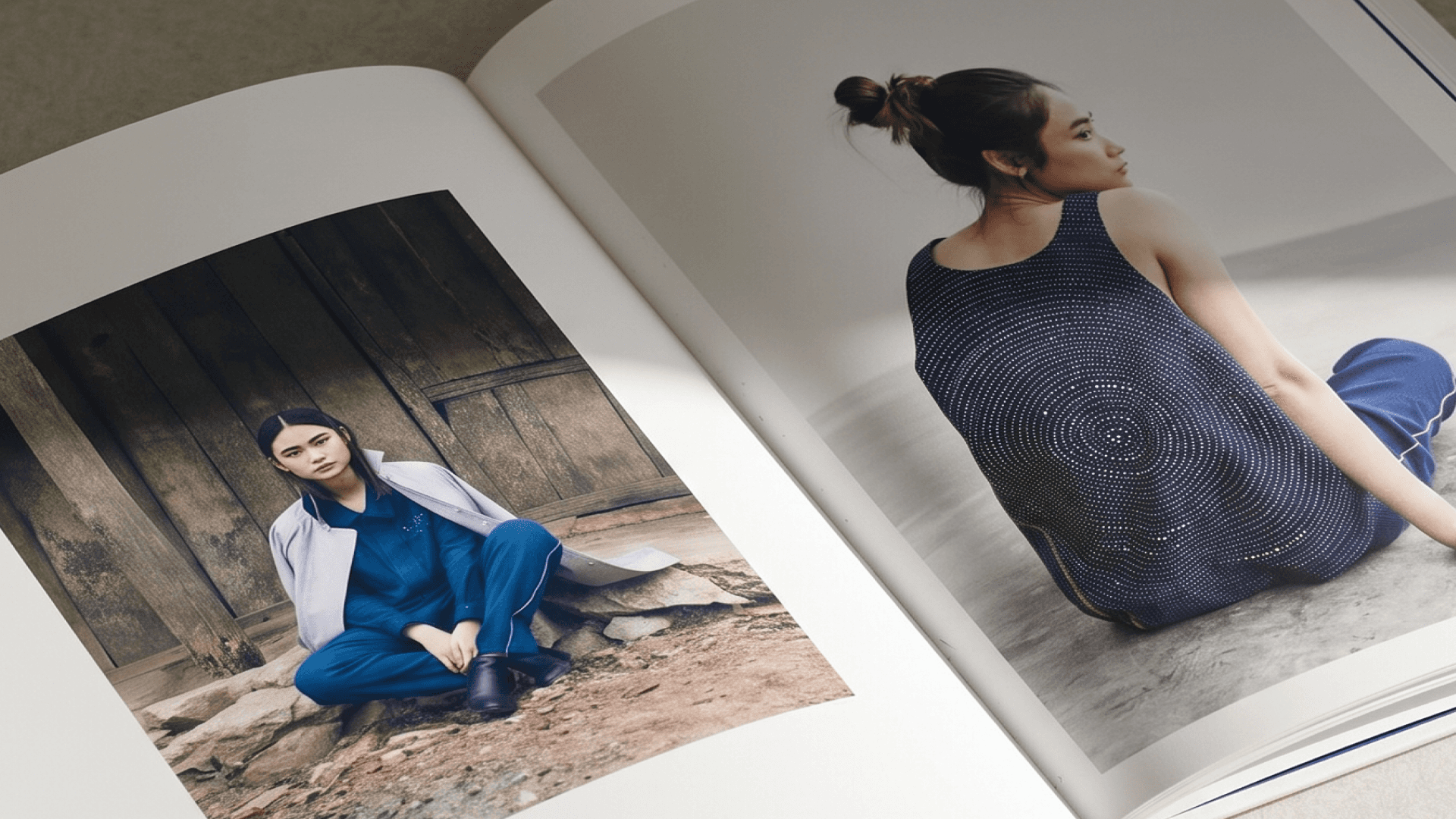
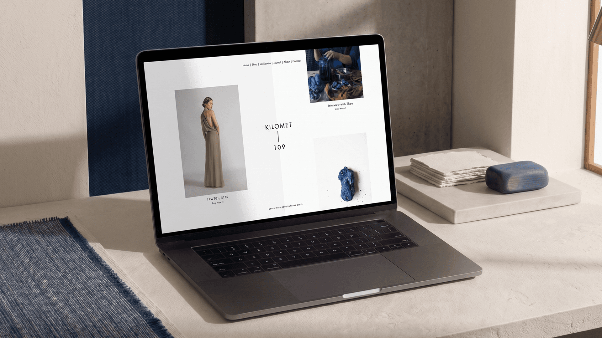
From Cao Bang to the world. Brand and e-commerce for Kilomet 109.
Kilomet–109 · Sustainable Fashion
Visual Identity | Website | Launch Campaign
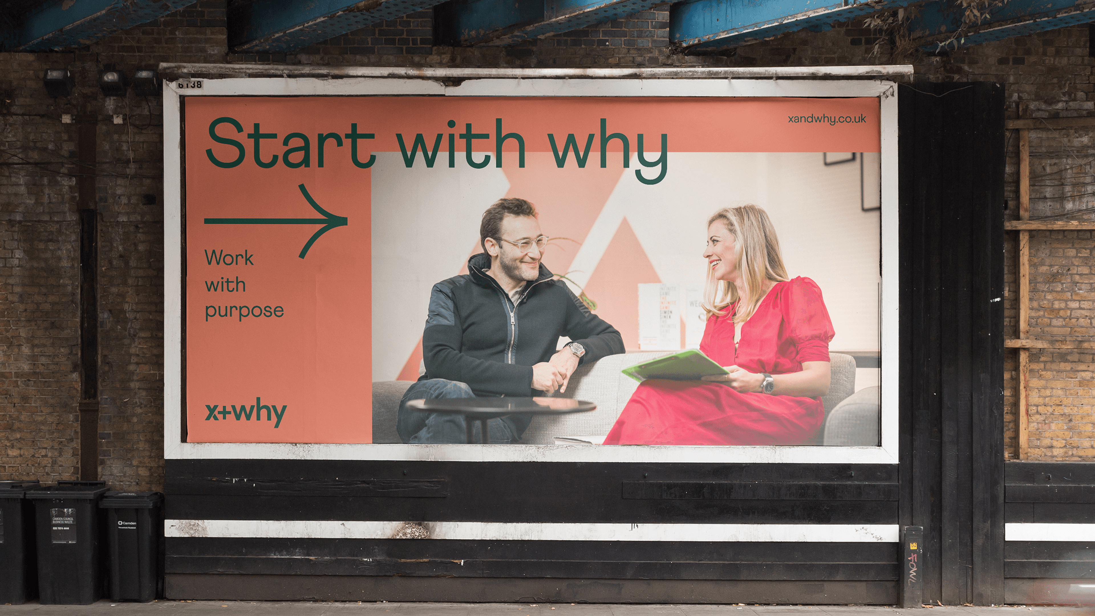
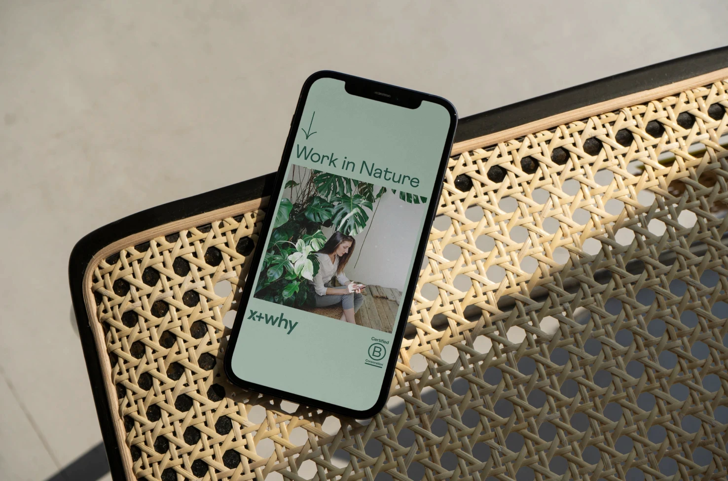
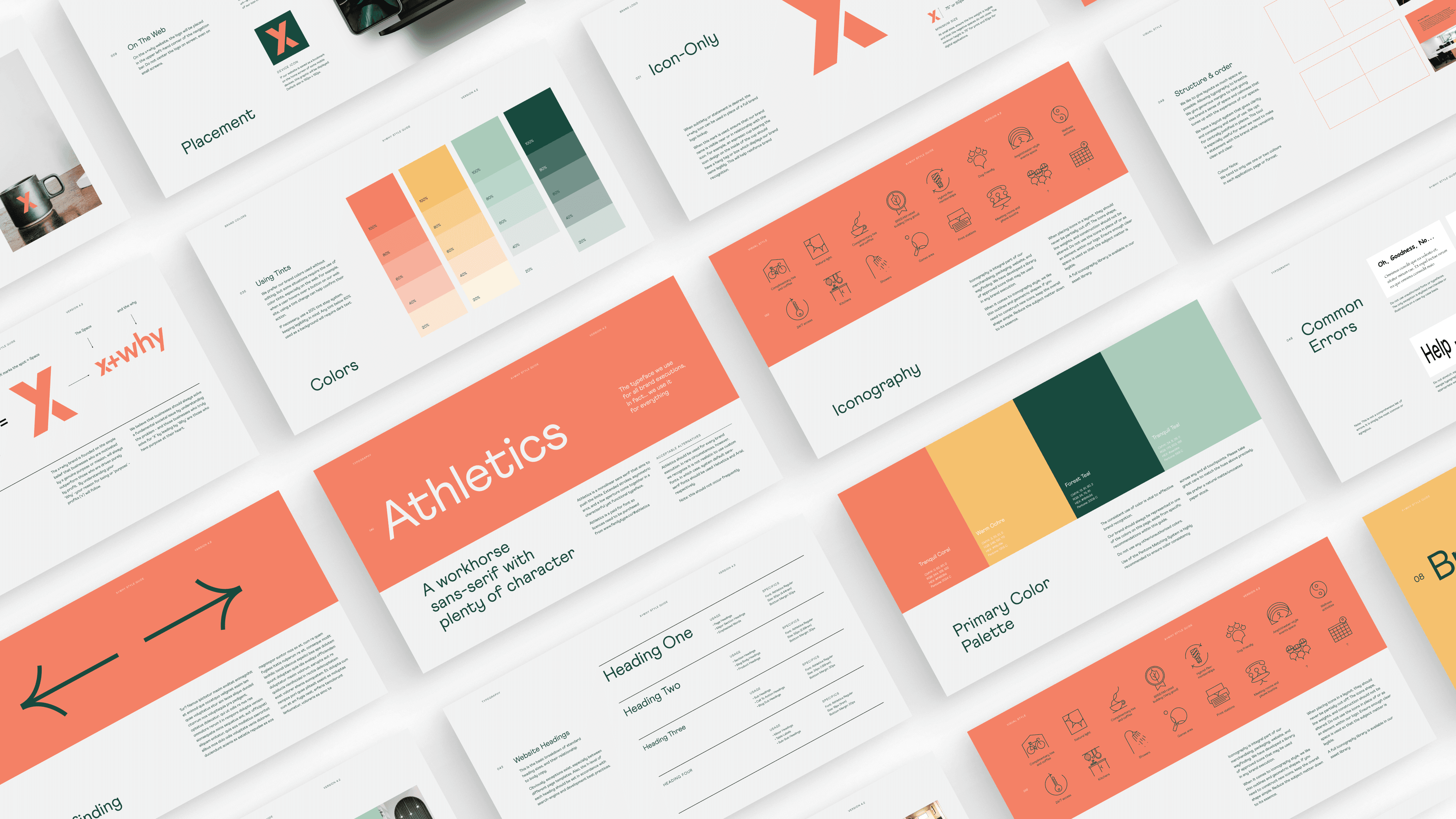
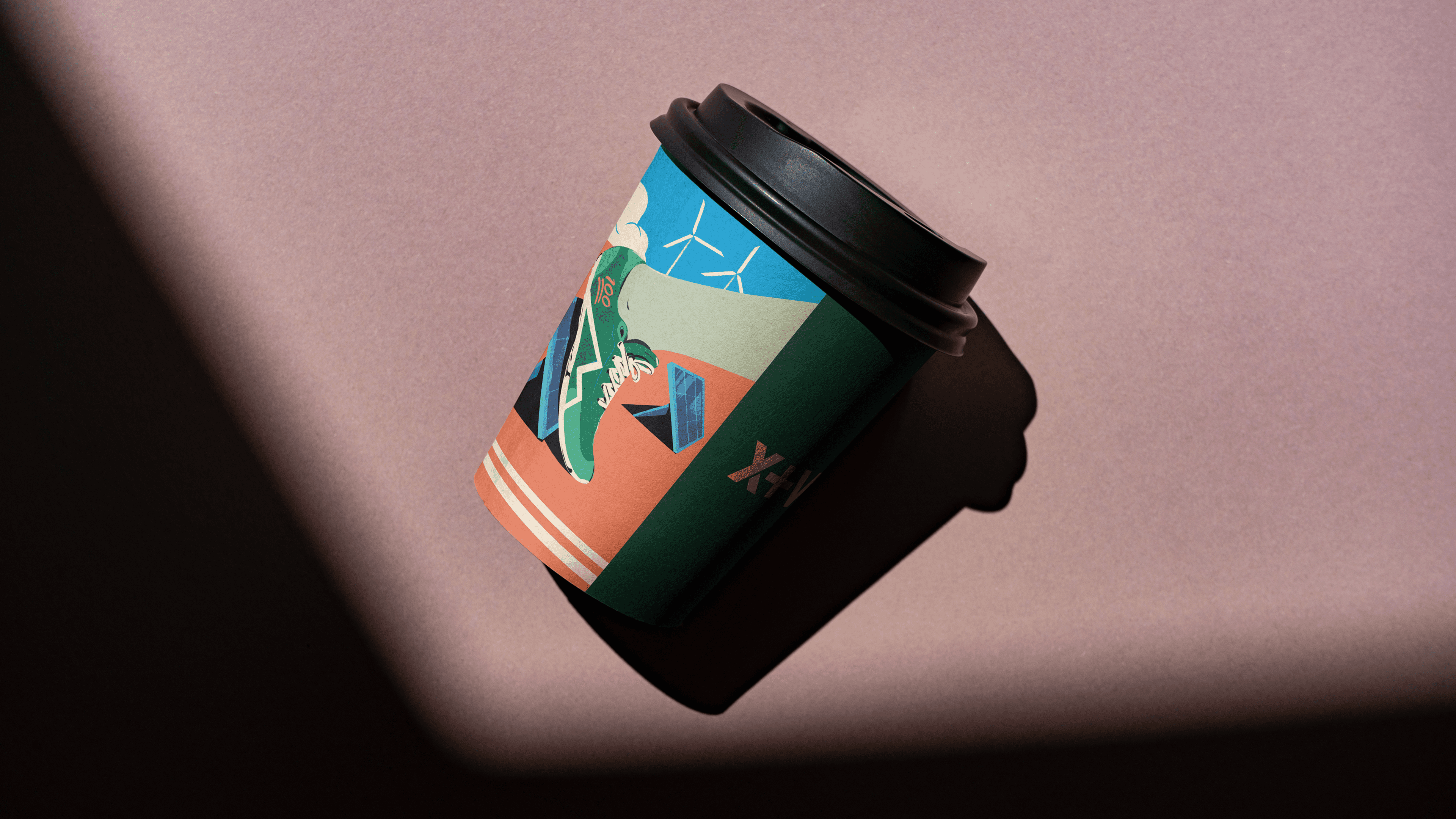
The founding identity of x+why, one of the UK's most purposeful workspace and hospitality providers. From one building to thirteen.
x+why · Flexible workspace and hospitality
Visual Identity | Brand System
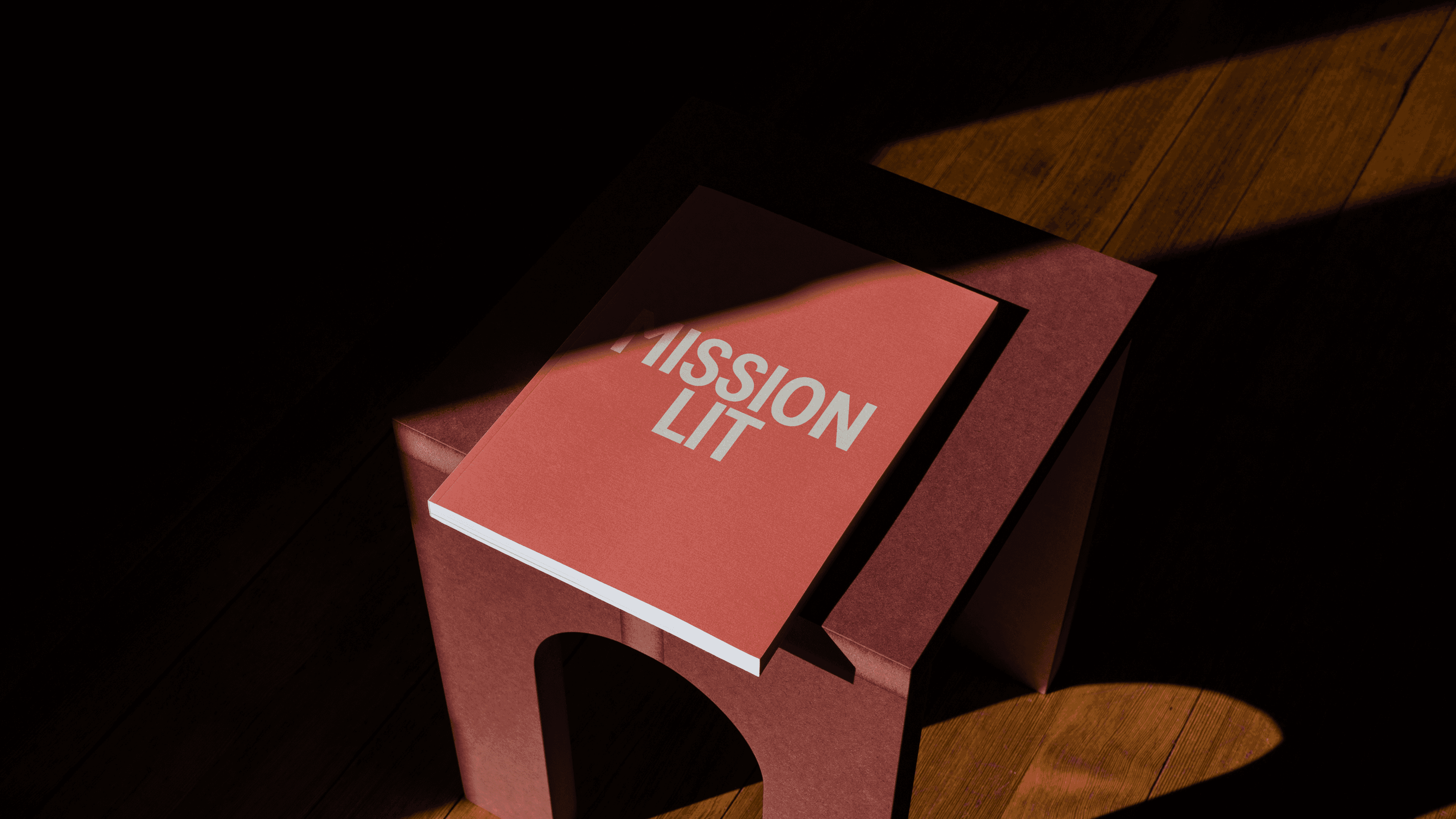
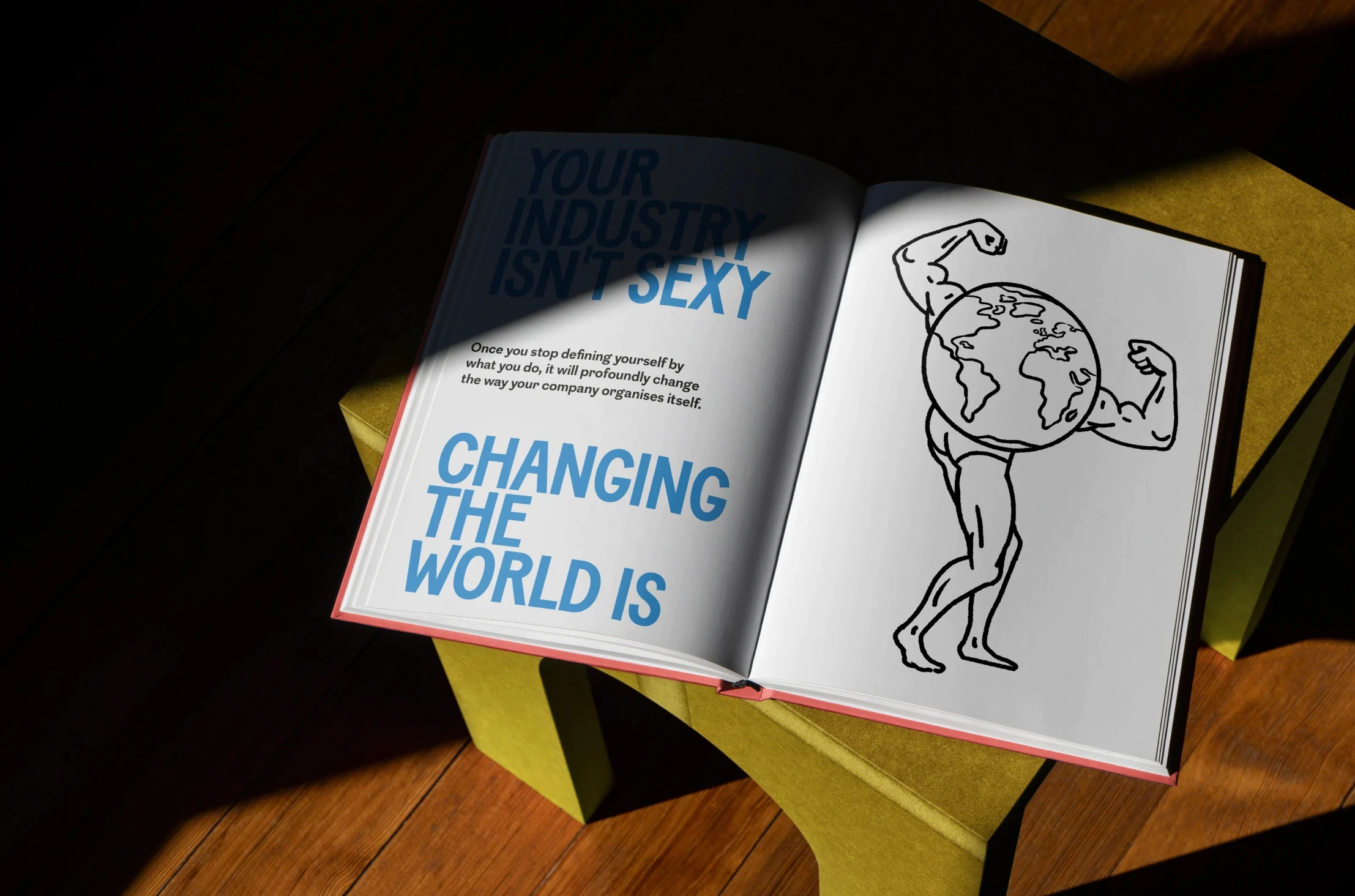
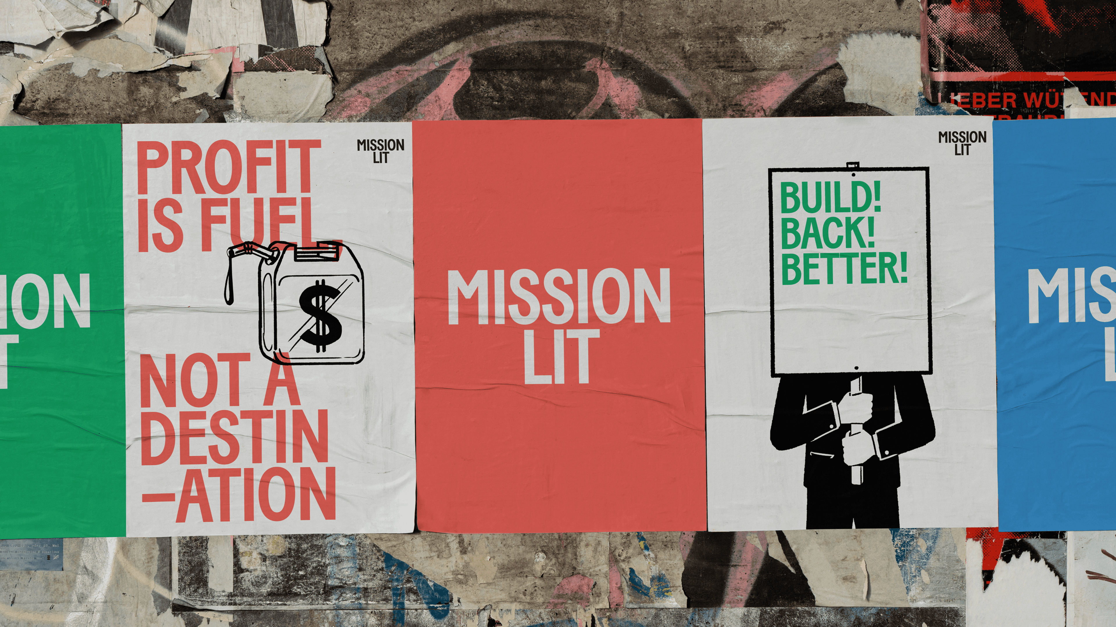
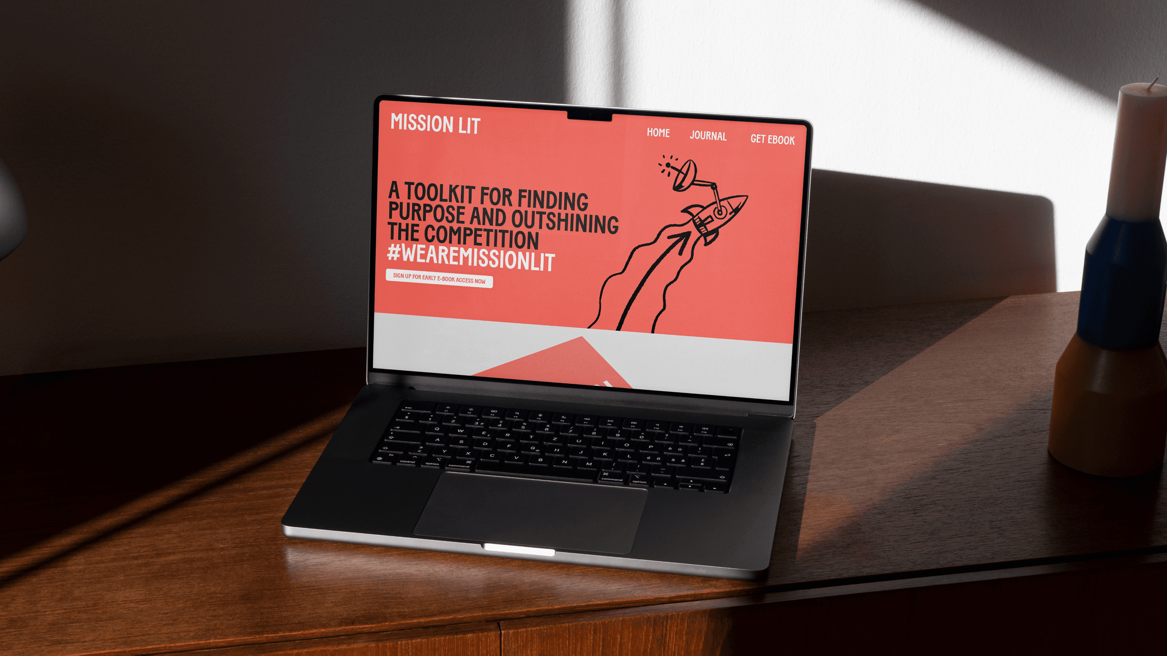
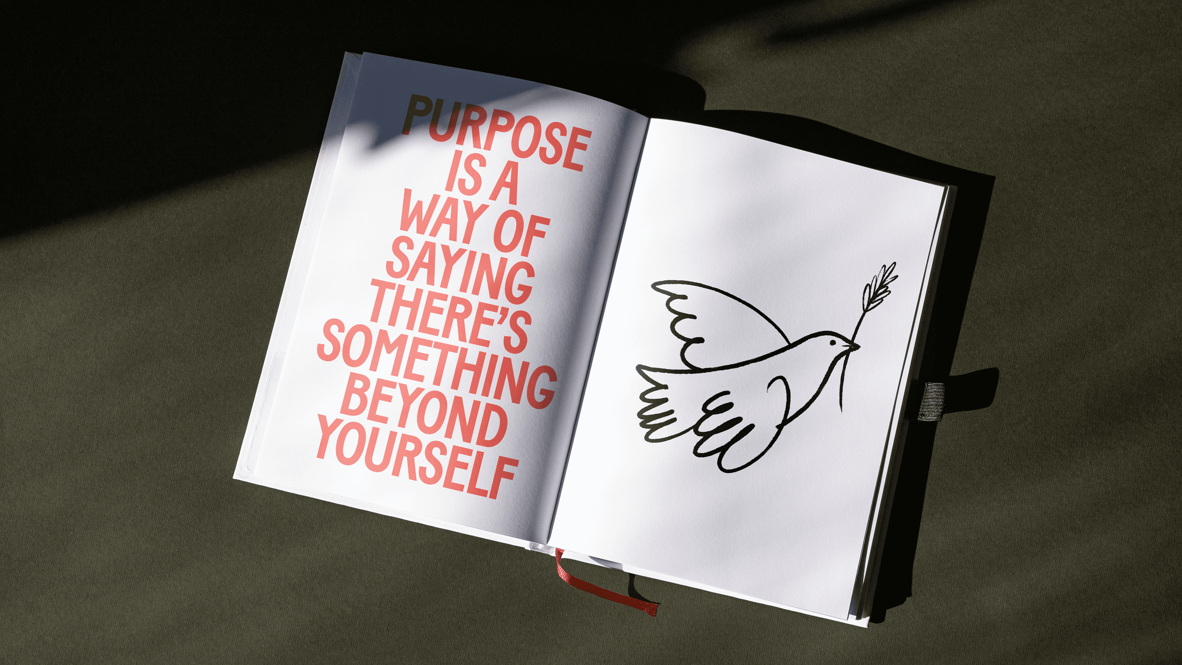
The purpose playbook featuring Patagonia, Innocent, Allplants and more. From a research paper to the book people send to their CEOs. A movement that keeps growing.
x+why / Mission Lit · Better Business
Brand System | Book Design | Digital Design
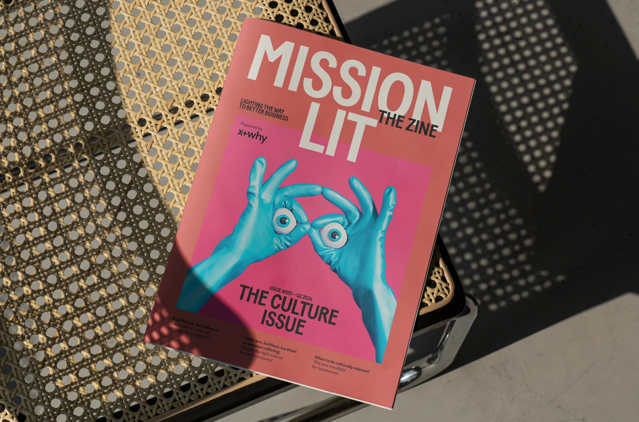
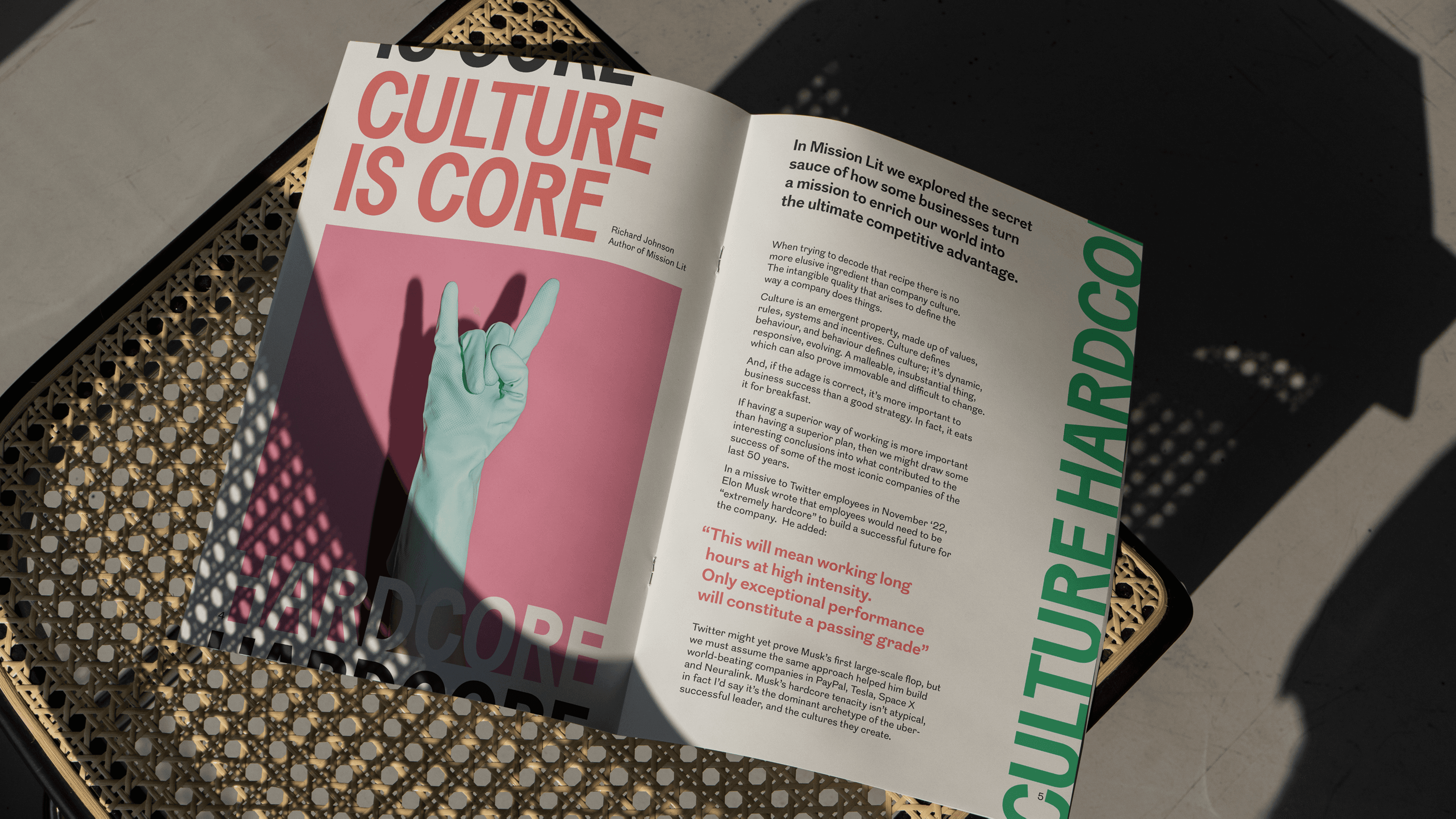
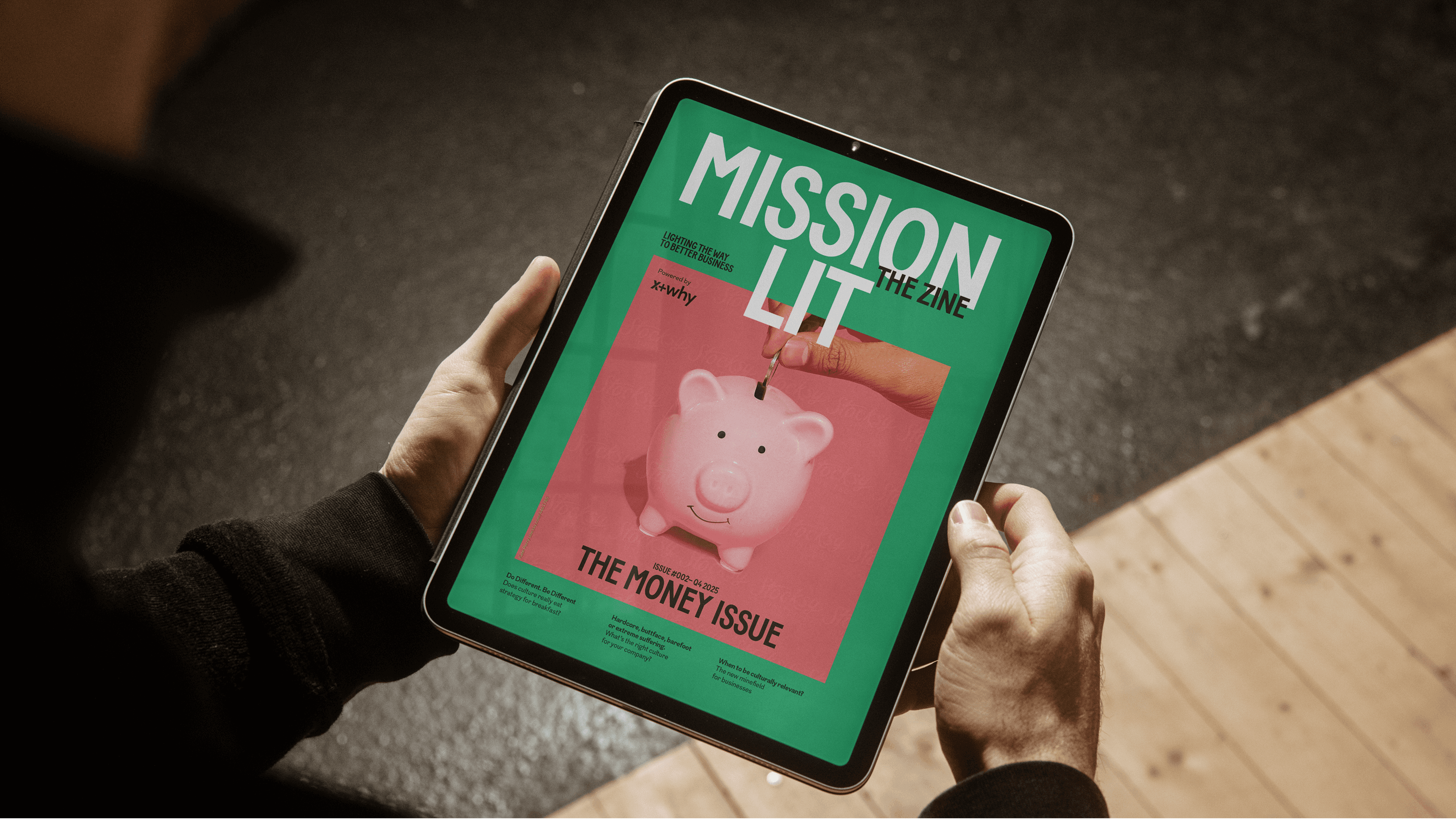
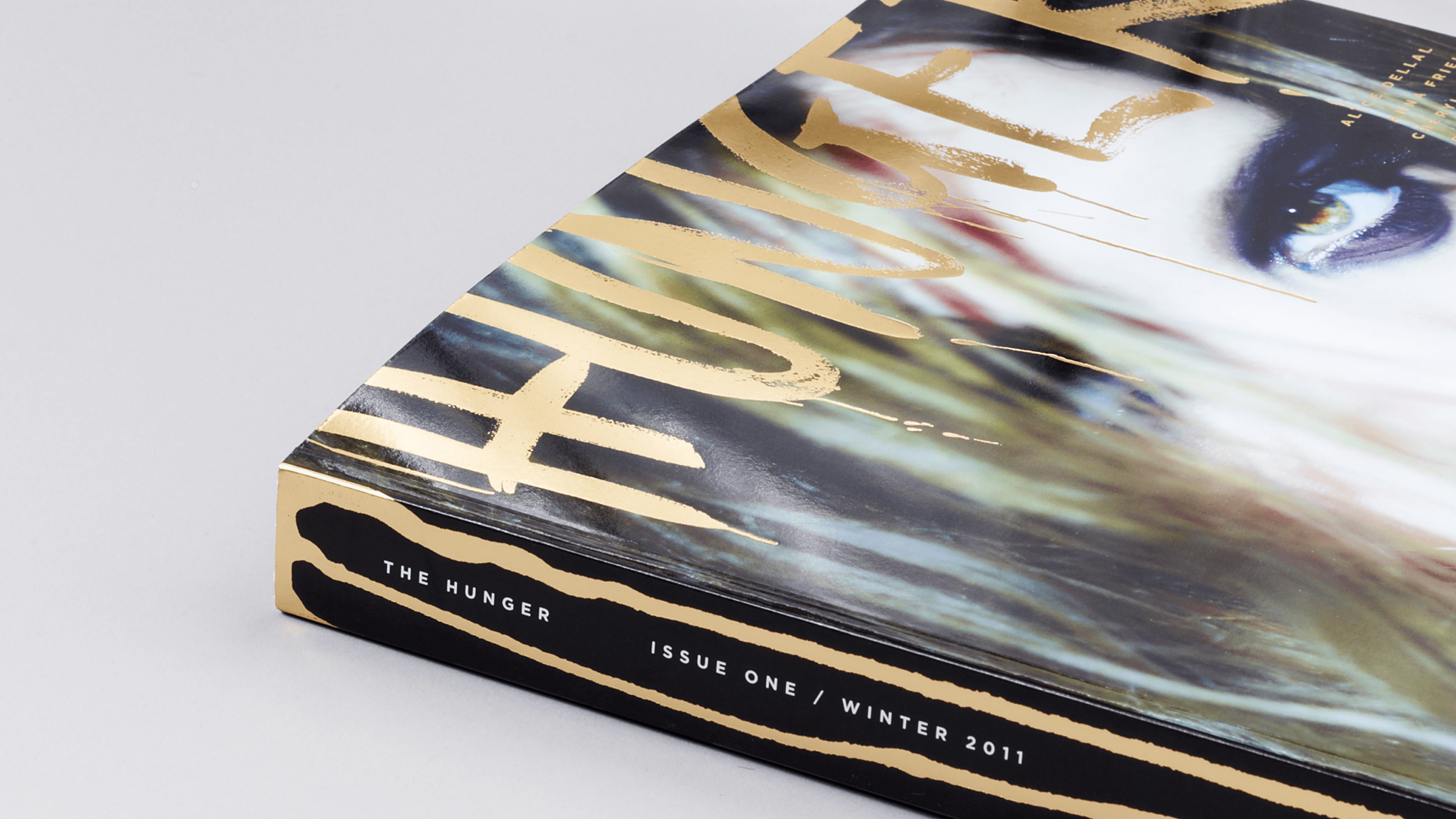
Issue one: 810 copies, 57 pitches for the next. Four issues later, the community is still burning.
x+why / Mission Lit · Better Business
Editorial Design and Art Direction
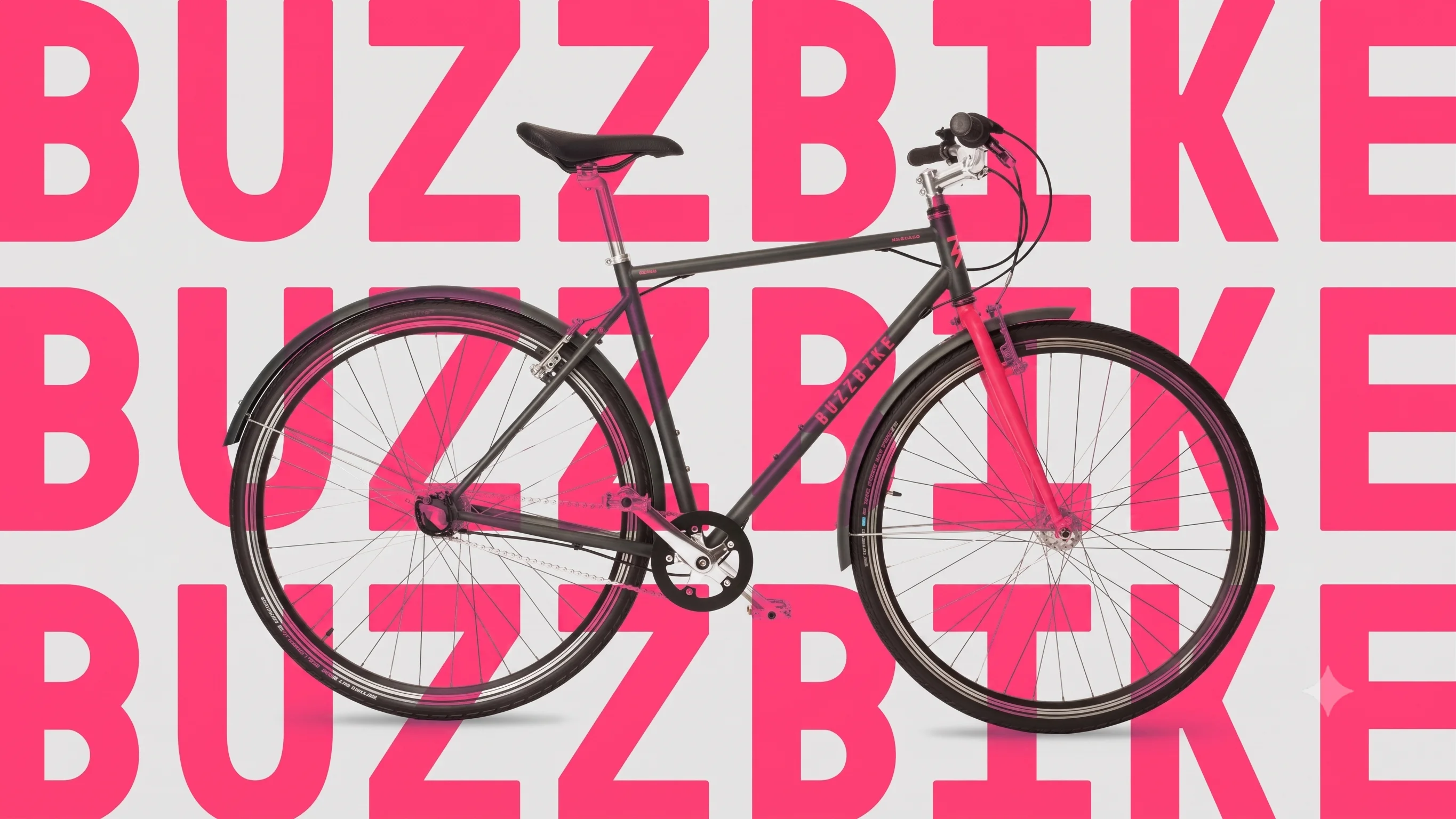
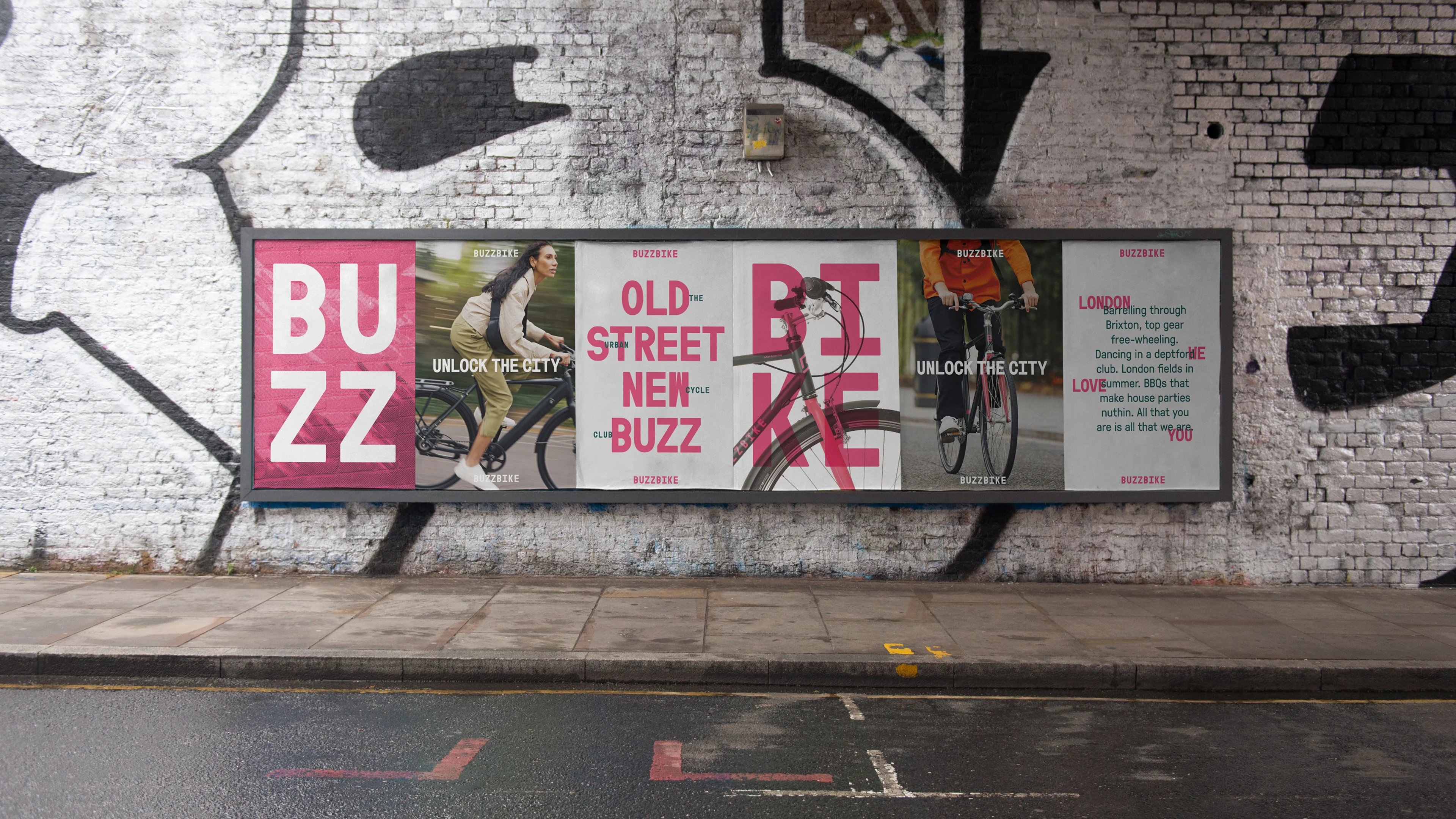
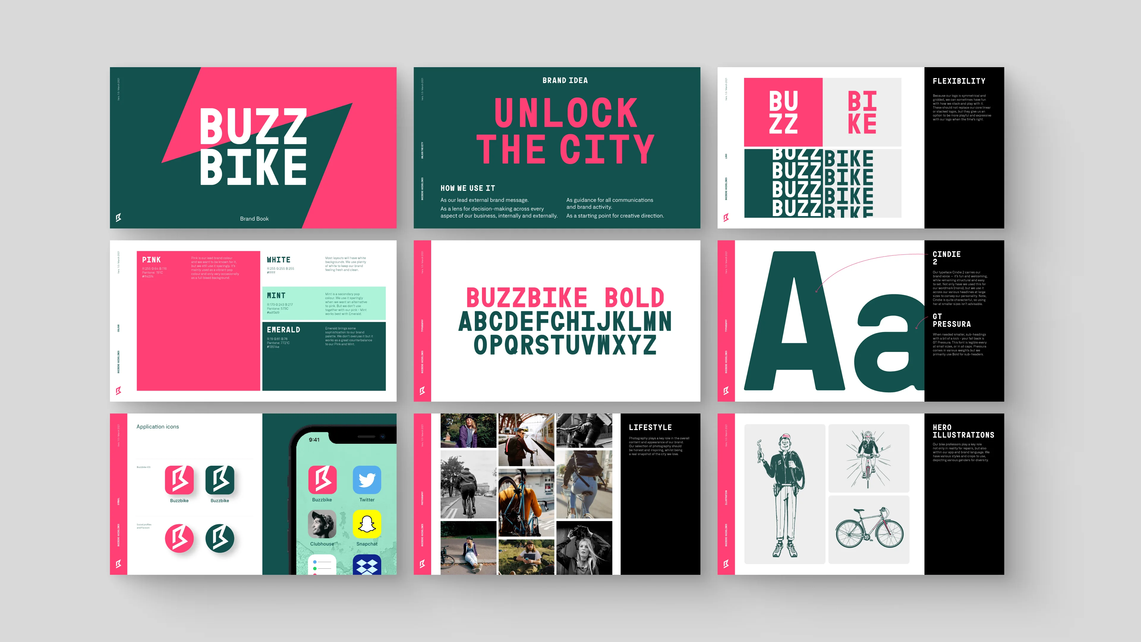
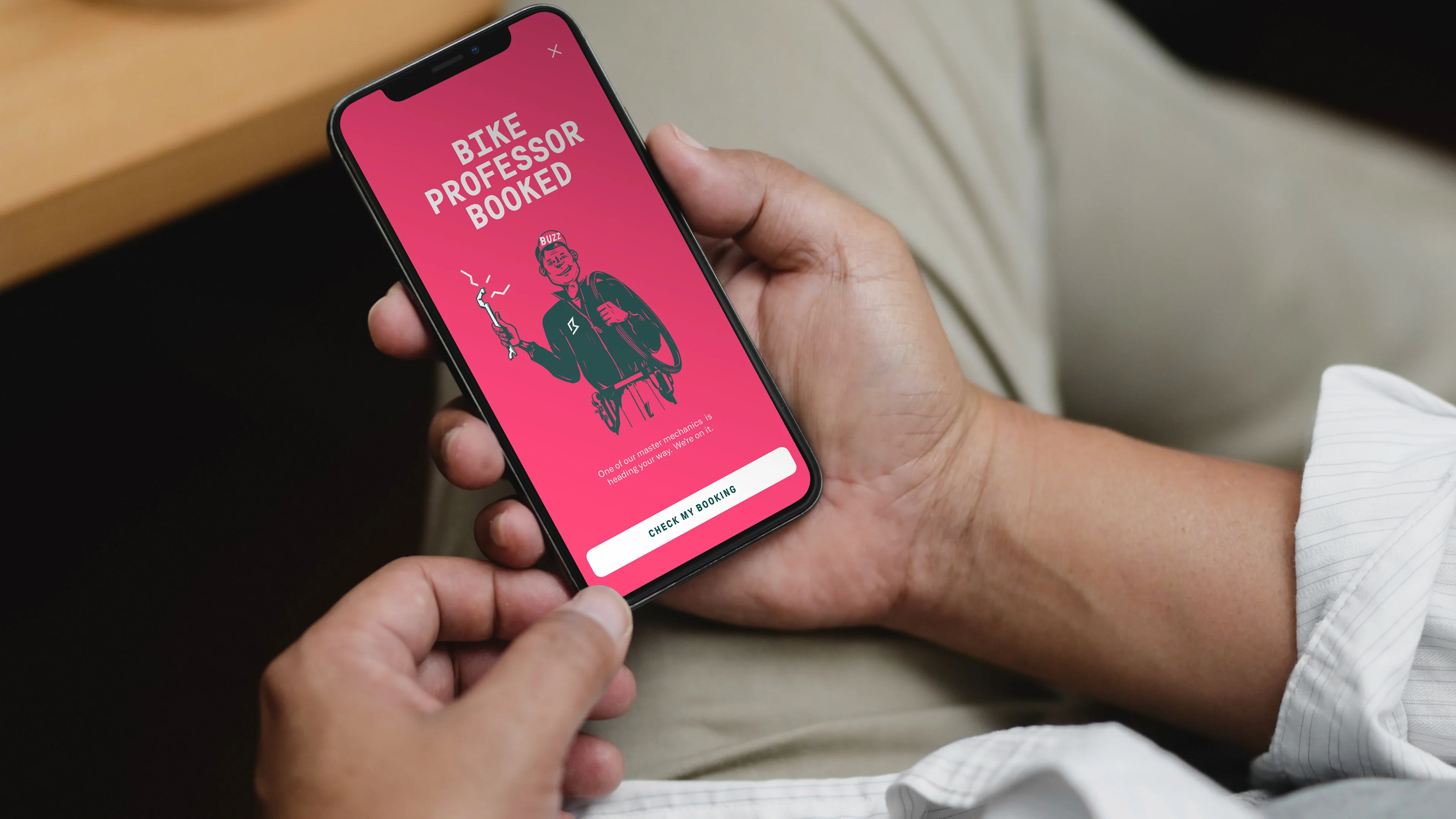
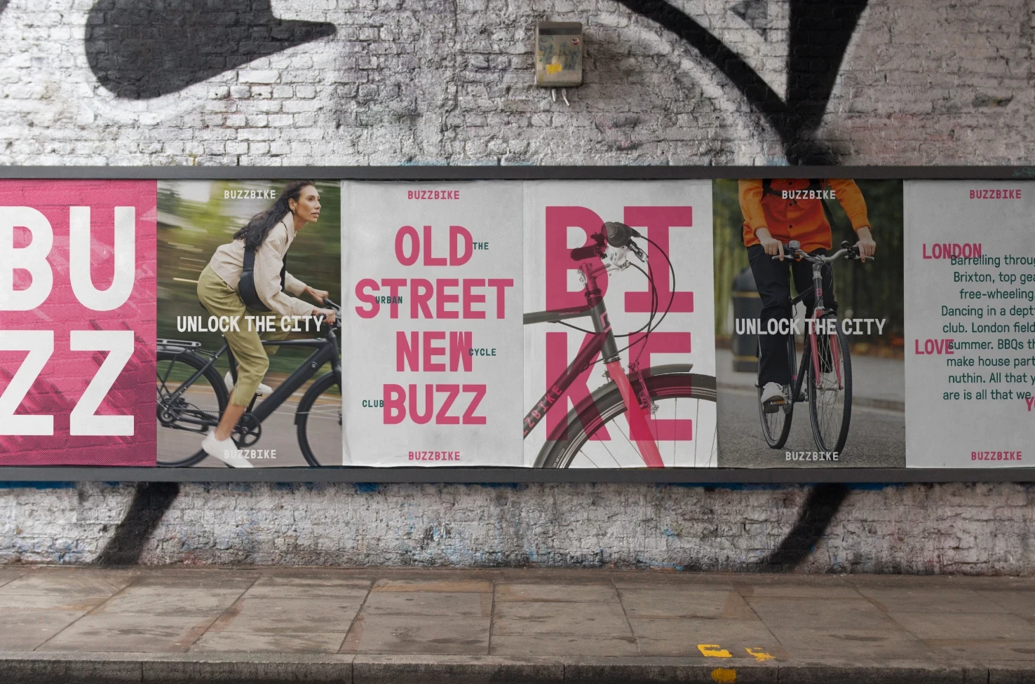
The brand was letting them down. The rebrand that made Buzzbike impossible to miss and doubled membership in 12 months.
Buzzbike · Bike Subscription Service
Visual Identity | Brand System
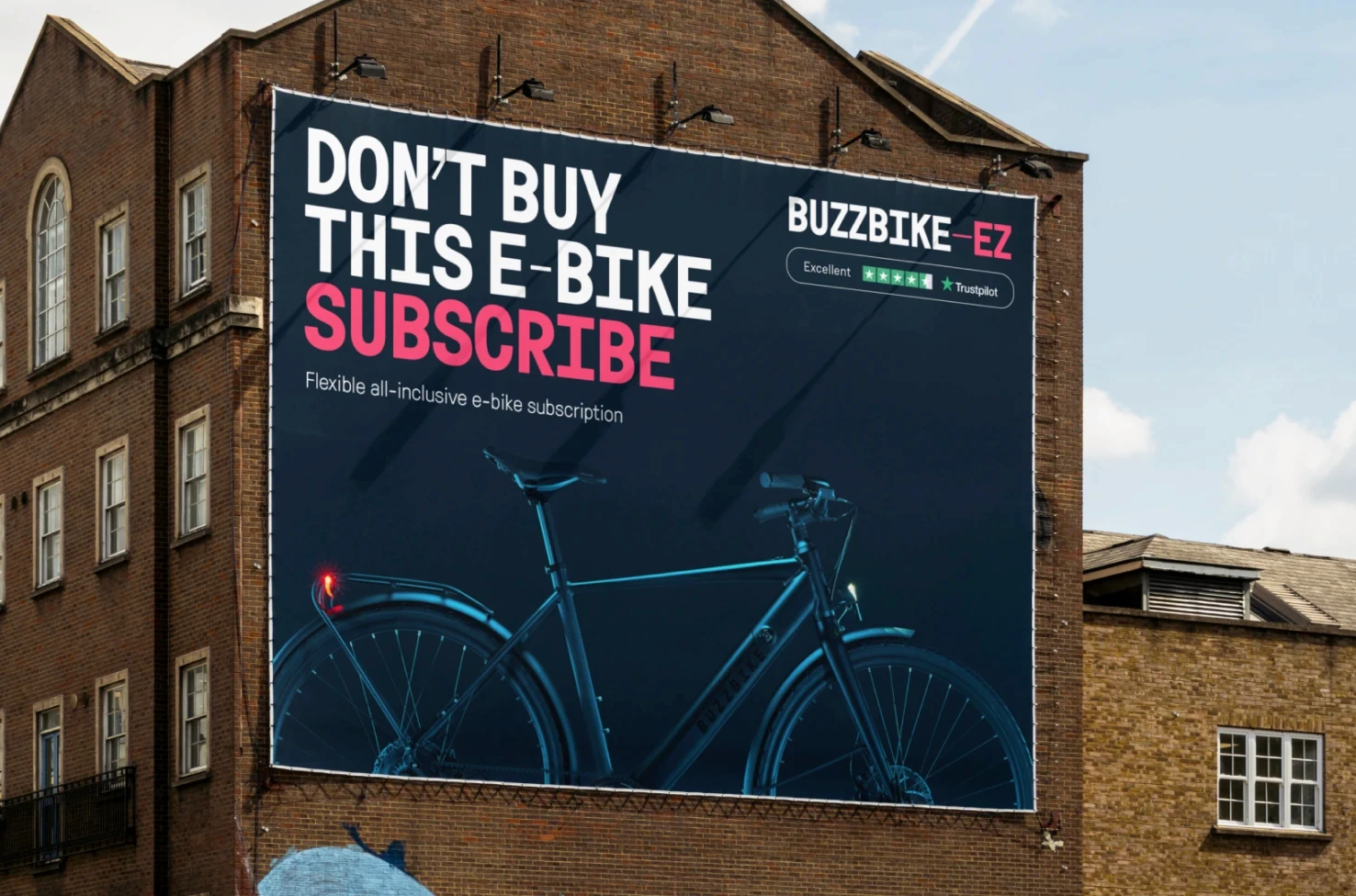
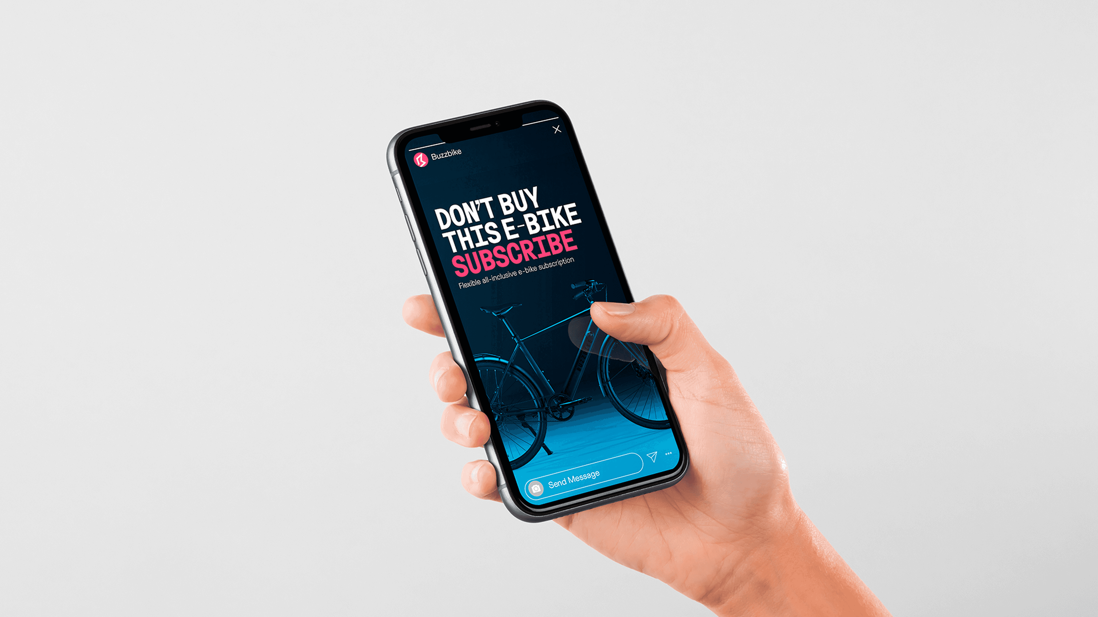
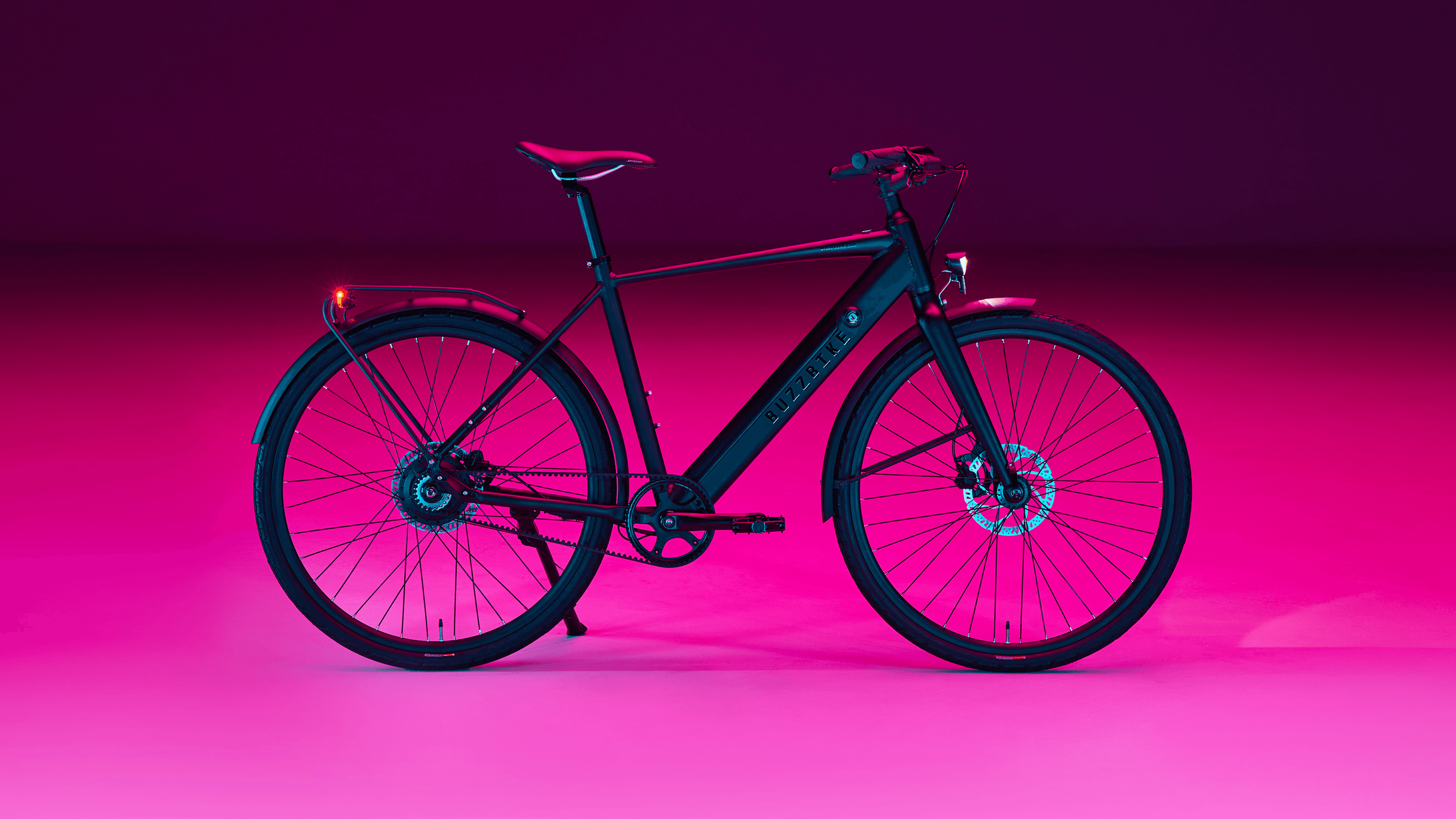

"Don't Buy This Bike." Waitlists followed. Inventory gone in 14 days. The ad creative that beat everything else for two years.
Buzzbike-EZ · Premium E-Bike Subscription
Sub-Brand | E-Bike Launch Campaign | Meta Ads | OOH
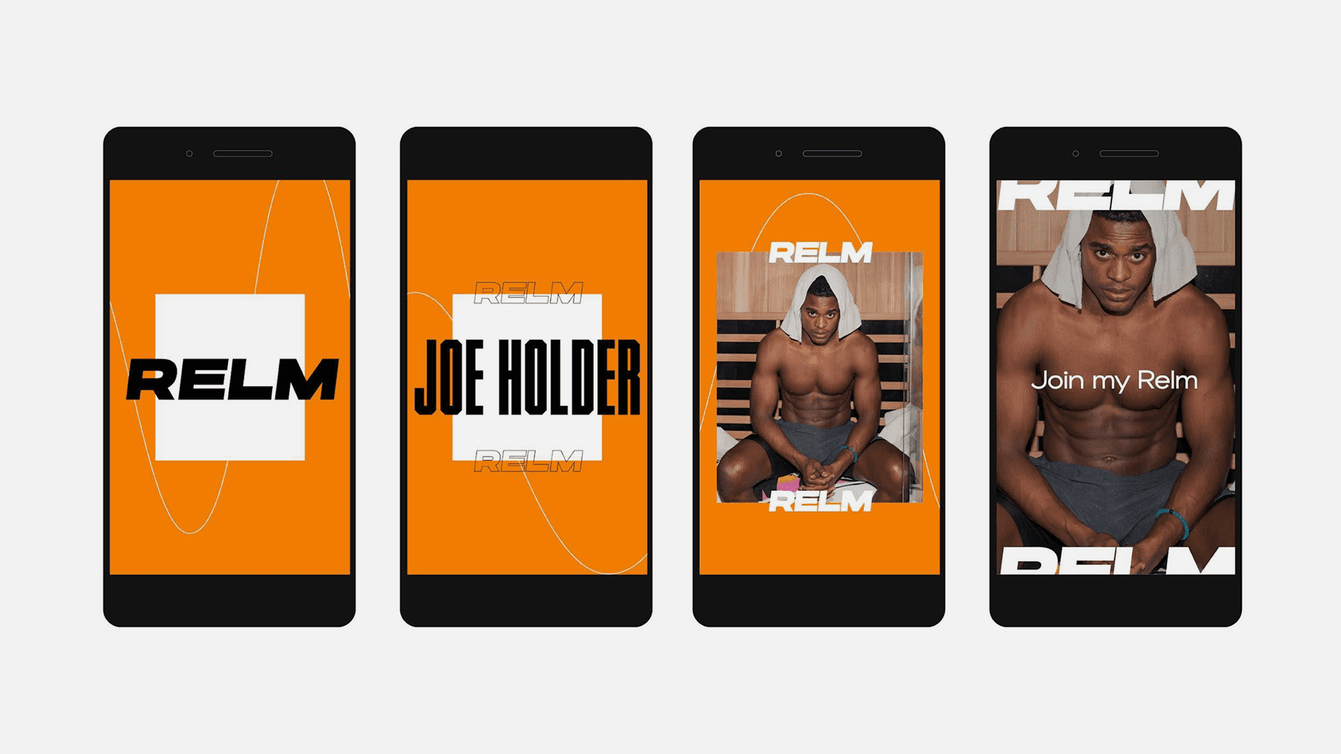
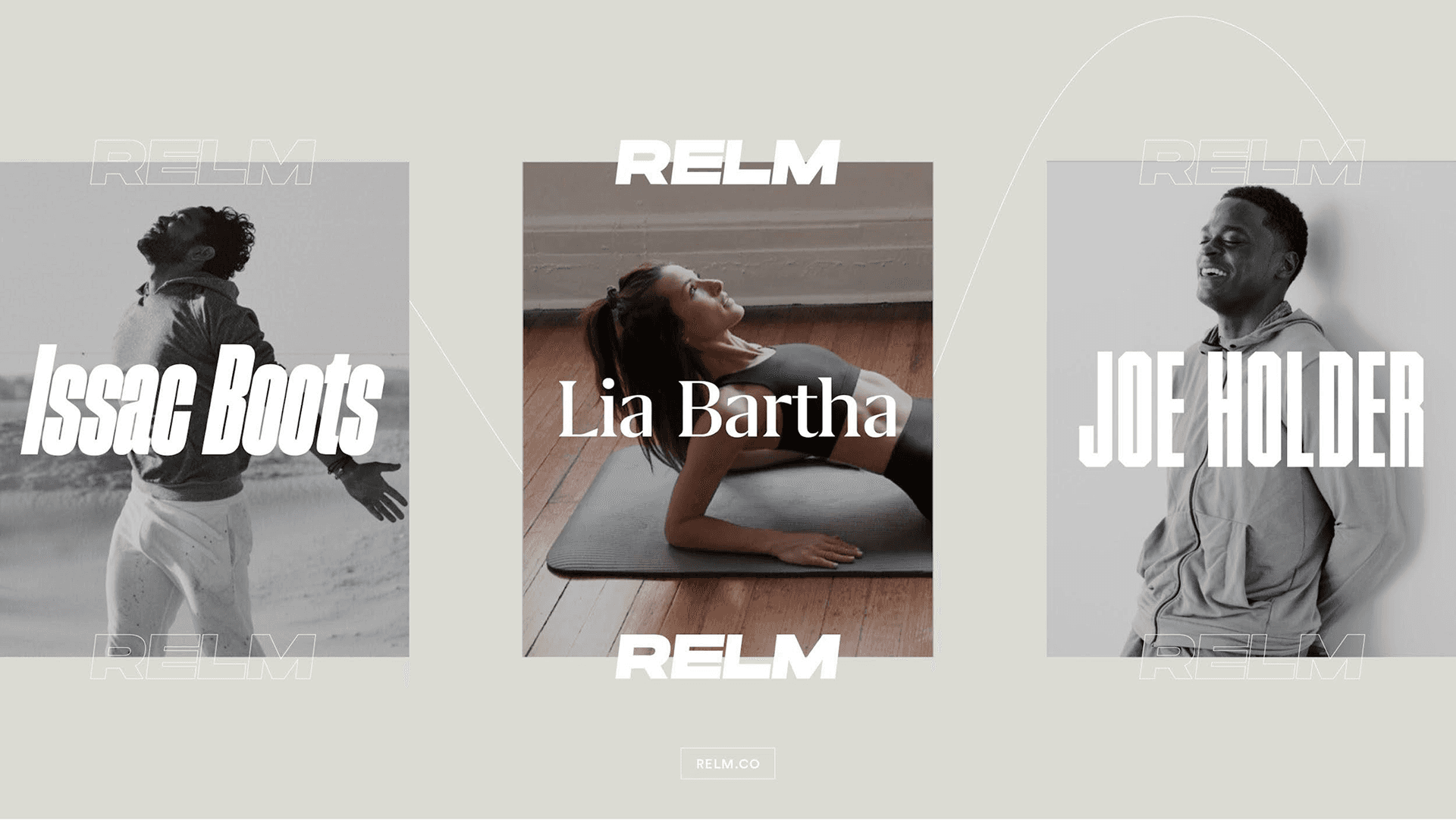
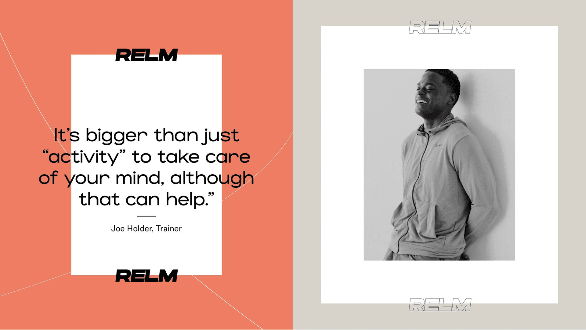
A fitness platform for creators. An identity system built to amplify every one of them.
Relm · Fitness Creator Platform
Visual Identity | Brand System
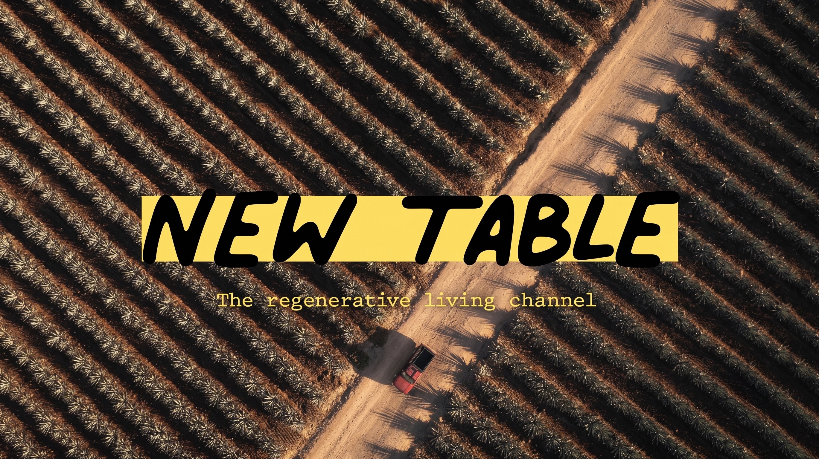
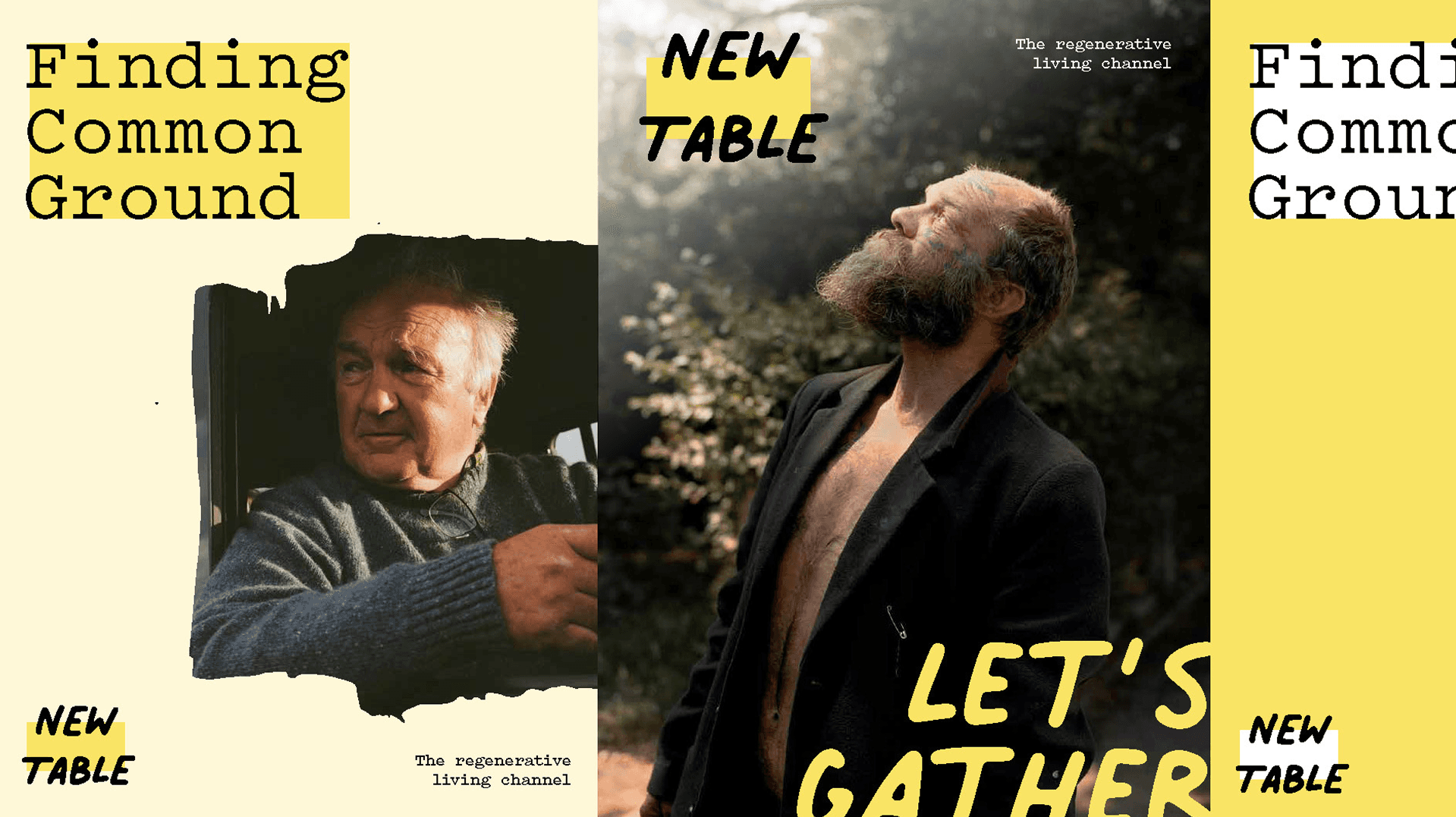
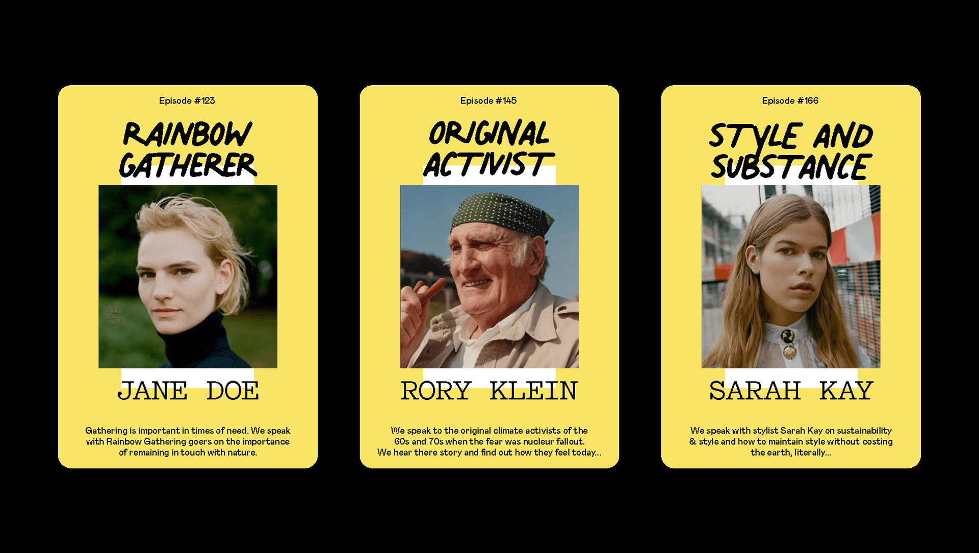
Visual identity for the regenerative living podcast changing the conversation.
New Table Podcast · Sustainability Podcast
Visual Identity
Partner Testimonial
Zeno Claes, Architect
Profile
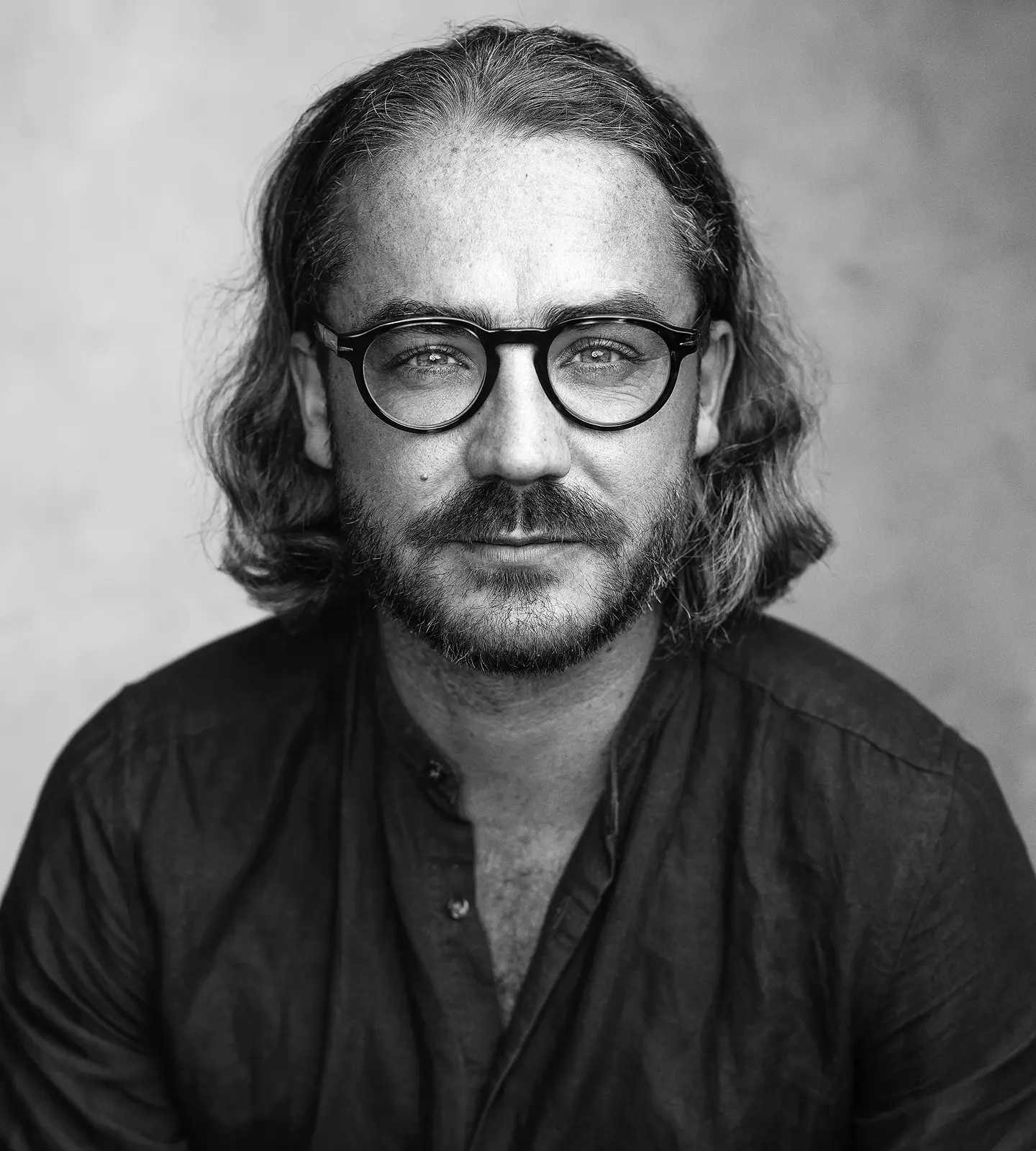
A bit about me.
My foundation is graphic design. That eye, for composition, typography, image, systems, detail, runs through everything I do. Strategy and storytelling are part of the work, but design is where I start.
I believe design is thinking made visible. That the strongest brands come from clarity, not noise. And that beautiful work should still be useful. I surf, write, travel and photograph alongside client work.
All ways of paying attention.
Partner Testimonial
Josephine Mosely, Brand & Communications Manager, x+why
An Invitation
Whether you're starting from a blank page or evolving something that already exists, the first step is a conversation. No pitch, no pressure.